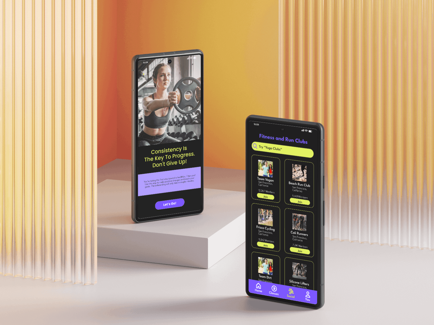
FitFam: Enhancing User Engagement with Social Features in a Health and Fitness App
UX Case Study by Adi Dove
My role
UX/UI Designer
UX Researcher
Designed entire app
Transformed vision into working prototype
Design and integrate social features that would help retain users and boost interaction in a health and fitness app that was struggling with keeping users engaged past the 3 week mark.
2 months
The Goal
Project timeline
Project Overview
Overview
DISCOVER
Conduct user testing
Provide surveys and questionnaires
Gather feedback
Implement feedback
Reiterate prototype
Create a sitemap and user flow
Wireframes
Working Prototype
Build style guide
Develop content
Build look & feel
DESIGN
VALIDATE
Design Phases
Overview

Identify goals and objectives
Identify the target audience
Conduct Research
User Interviews
Create a persona
How might we integrate additional social features into a health/fitness app to increase social engagement after the three week point?
Problem statement
Discover
FitFam Background
Discover

18-34 years old
Very tech-savvy —they are on their phones for several hours a day
Very budget-conscious
Messaging and communicating with friends and family is a very important part of their daily lives
Very health and fitness conscious
Target Audience
Discover
Information Hierarchy- the structure is laid out in a site map prior to app creation
Visual Hierarchy- each screen is structured with levels of importance clearly delineated
Simplicity- only the most important elements are included in the finished design
User-centric- user testing is done at many points in the development of the app to ensure all design choices are guided by their needs and wants
Accessibility- ensures that all users can interact with the product regardless of their abilities, context, or situation
Key Principles When Designing
Discover

On average user engagement is heavy for the first three weeks then it drops off and soon after users delete the app.
The current app has no mechanism to connect with others on the app, whether its to give encouragement or message about important milestones.
Social features in fitness apps, such as the ability to connect with friends, join fitness challenges, and share progress, contribute to higher user engagement.
Apps that foster a sense of community and provide social support mechanisms can significantly enhance users' commitment to their fitness goals.
The Customer Problem
Discover
The Customer Problem

The Solution
Discover
Creation of a Public Forum with many different Topic and Activity based options
A private messaging inbox and the ability to message other users
The ability to share milestones accomplished privately or publicly
The ability for other users to “like” accomplishments and shares of users
Notifications of any social interaction greeting the user
A Leaderboard for different sports and accomplishments showing high scores
The ability to join Local and National Clubs based on interest
Discovery
The hypothesis is that if members of the family or group can message individuals or the entire group at any point throughout the experience, engagement and repeat usage metrics will increase.
How should the messaging be integrated within the existing features?
Is there a general messaging feature allowing users to message each other separate from health and fitness activities?
Is adding features that allow users to message each other enough to increase repeat usage and engagement?
Hypothesis
Research Questions
Research Synthesis
Discovery
Efficacy of Social Features in Fitness Apps
• Social aspects in fitness apps significantly enhance user engagement and long-term usage.
• Features like connecting with friends, fitness challenges, and progress sharing foster community and accountability.
After researching studies on fitness and smart phone usage I was able to distill my findings to the main points below:

• A 2020 study linked habit formation and social support to continued app use and goal commitment.
• College students in Beijing reported increased physical activity and self-efficacy due to peer encouragement through fitness apps.
Importance of Social Support in Habit Formation
• Millennials in South Africa valued entertaining and . interactive social features, enhancing engagement and enjoyment.
• Gamification and social networking elements (e.g., leaderboards, group challenges) make fitness activities more engaging and fun.
• These features improve user motivation and adherence to fitness routines.
Emphasizing social components can create supportive and compelling environments.
Apps with strong social features help users achieve fitness goals and maintain healthy lifestyles.
Role of Gamification and Community
Implications for Developers

Discovery
I’m busy, I want a fitness app that is fun
to use and has a mix of features.

Madison
Age: 24
Education:
Bachelors
Location:
Seattle, WA
Occupation: Marketing
”
“
Devices:
Background: She has a busy work and social life
and uses the app to stay in shape and connect
with friends to stay motivated through the app.
Goals: Stay in shape, have varied fitness activities accessible without equipment, connect with friends
Needs: Physical activity, staying in shape, connecting socially and staying motivated, balancing work and life balance with fitness, finding varied and easy workouts to do at home
Frustrations: Feeling isolated, lacking motivation after busy days, being bored by the same workouts
In order to better understand the users of FitFam, I created a user persona to help me to visualize pain points, goals and needs of the average FitFam user. This persona was Madison, who you can see below.
User Personas
Competitive Analysis
Discovery
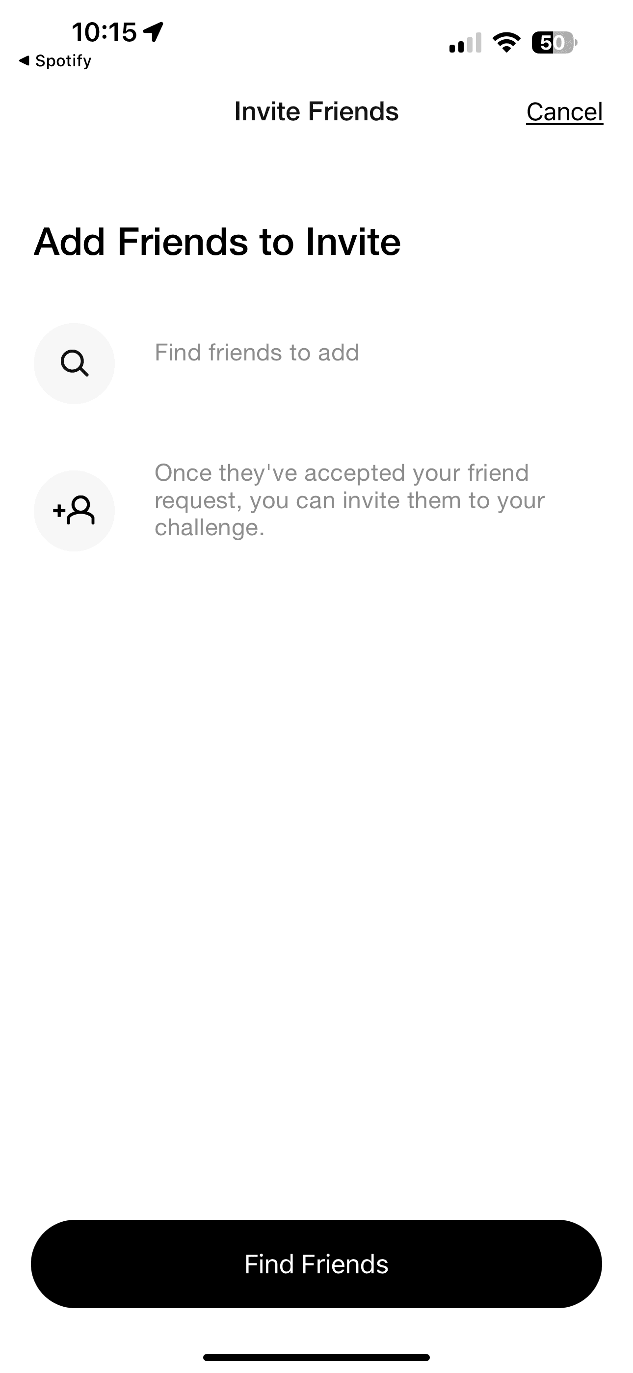
Find how fitness apps integrate social features in order to direct FitFam redesign.
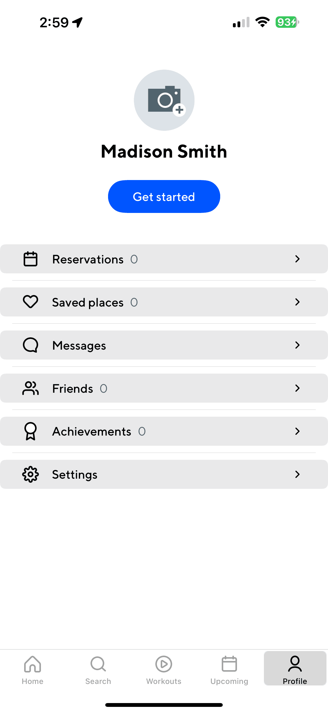
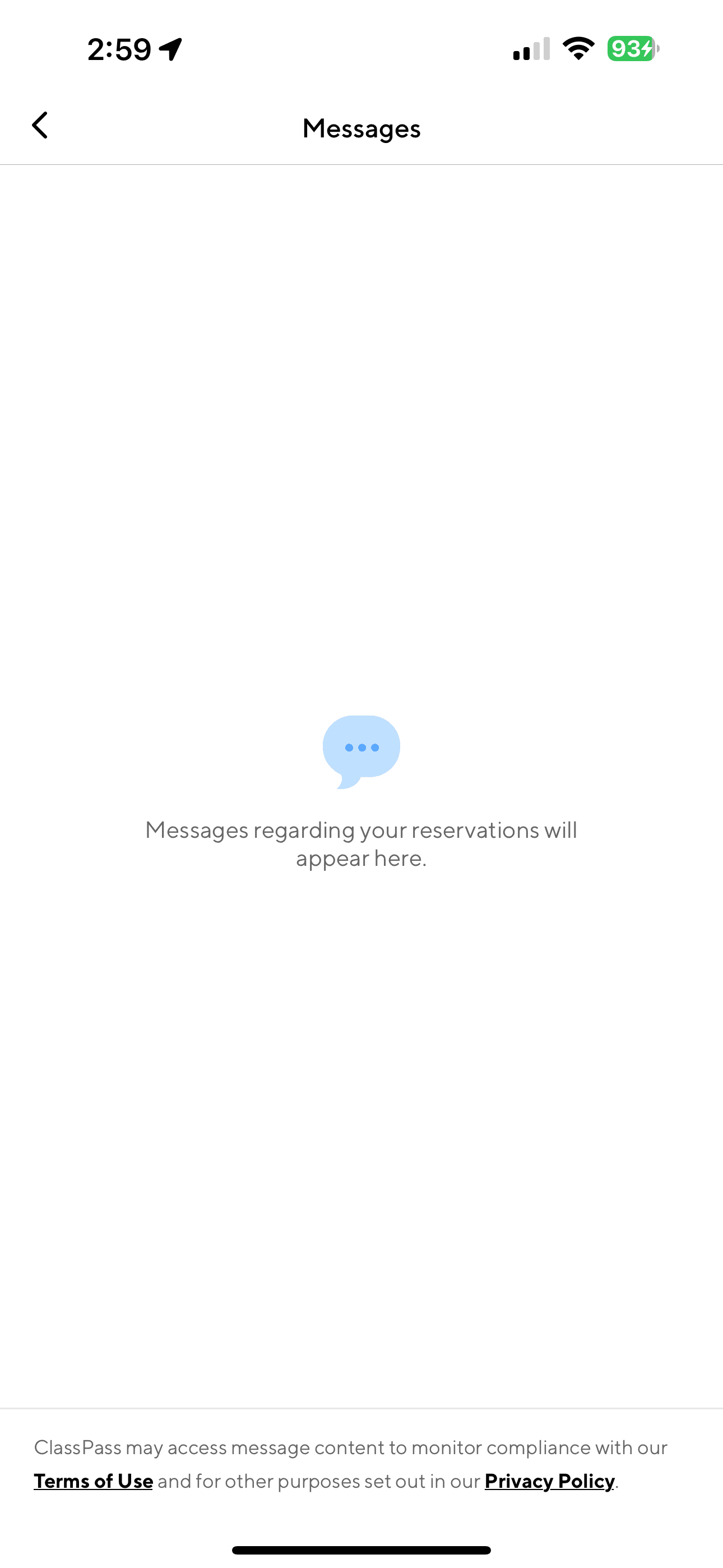
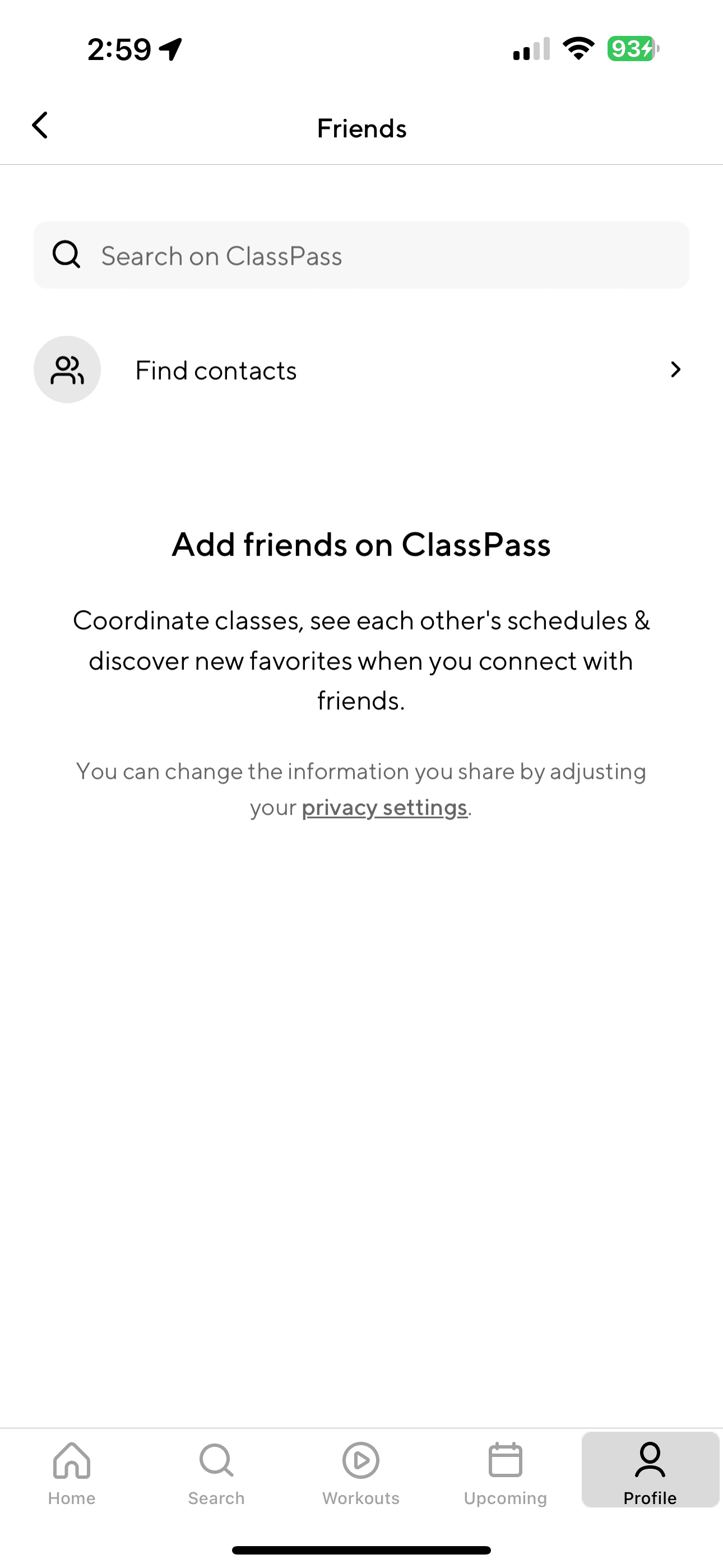
Strava, Nike Run Club, ClassPass
Fitness Apps Selected:
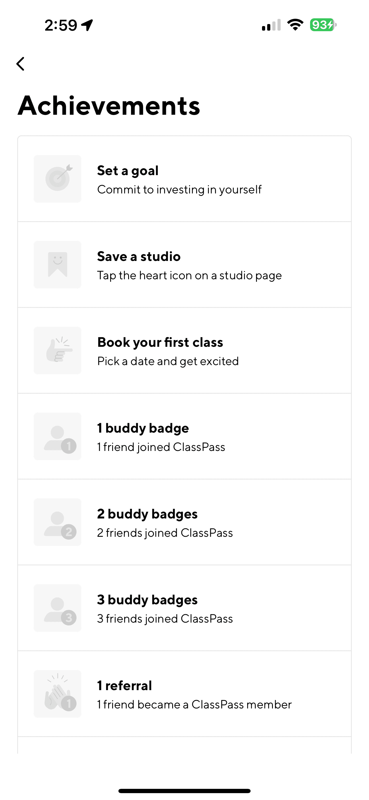
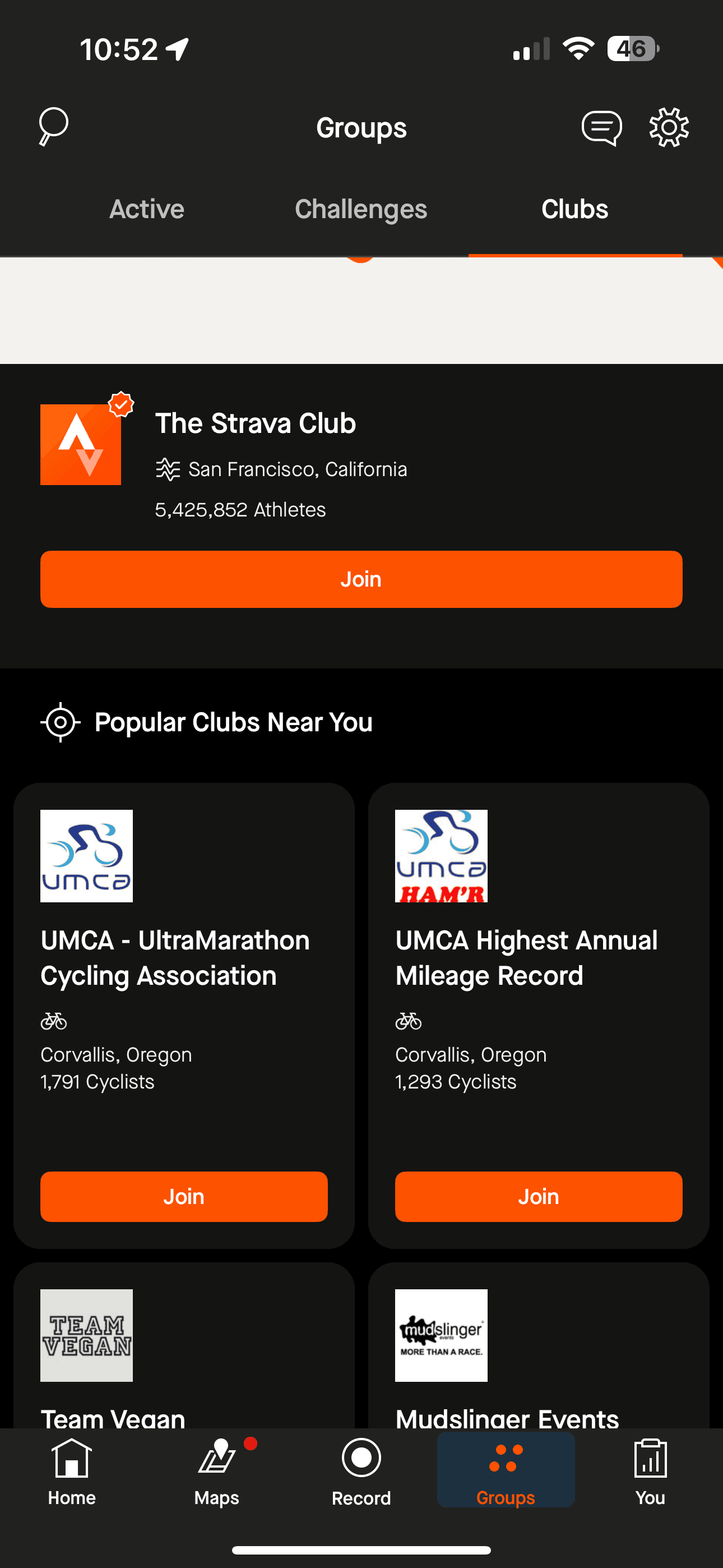
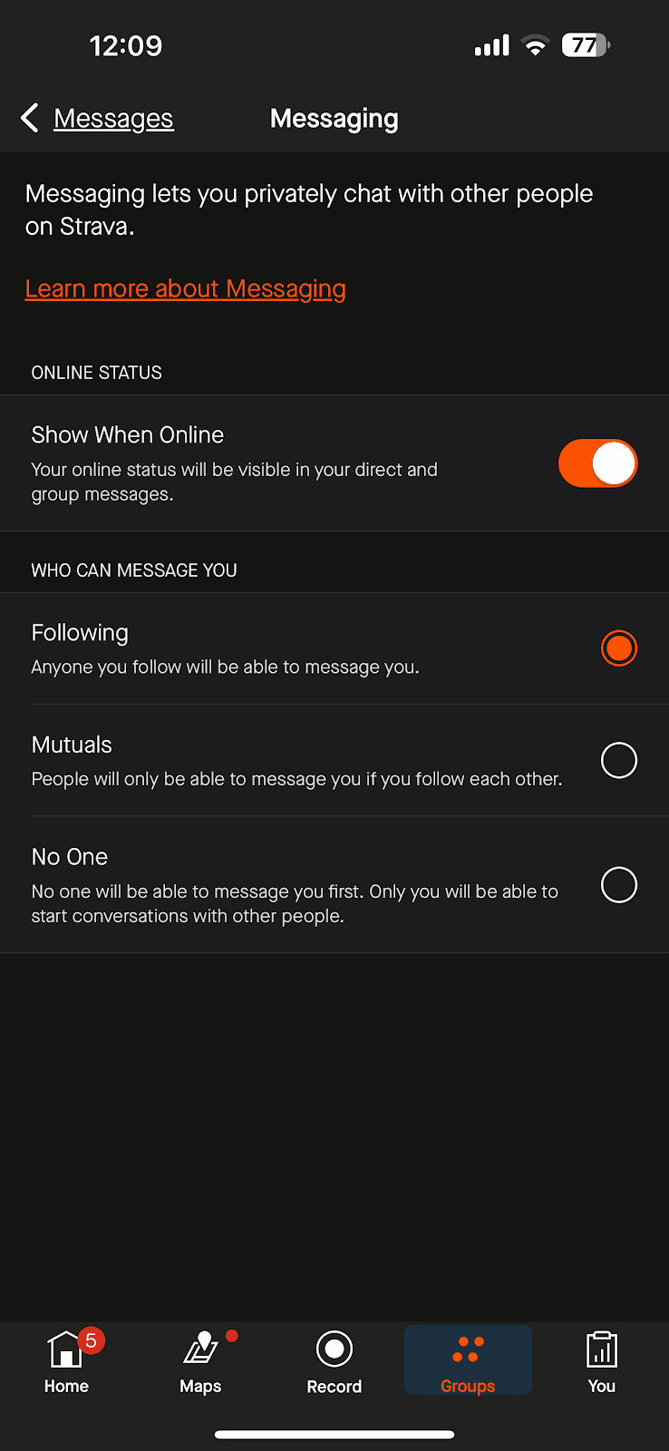
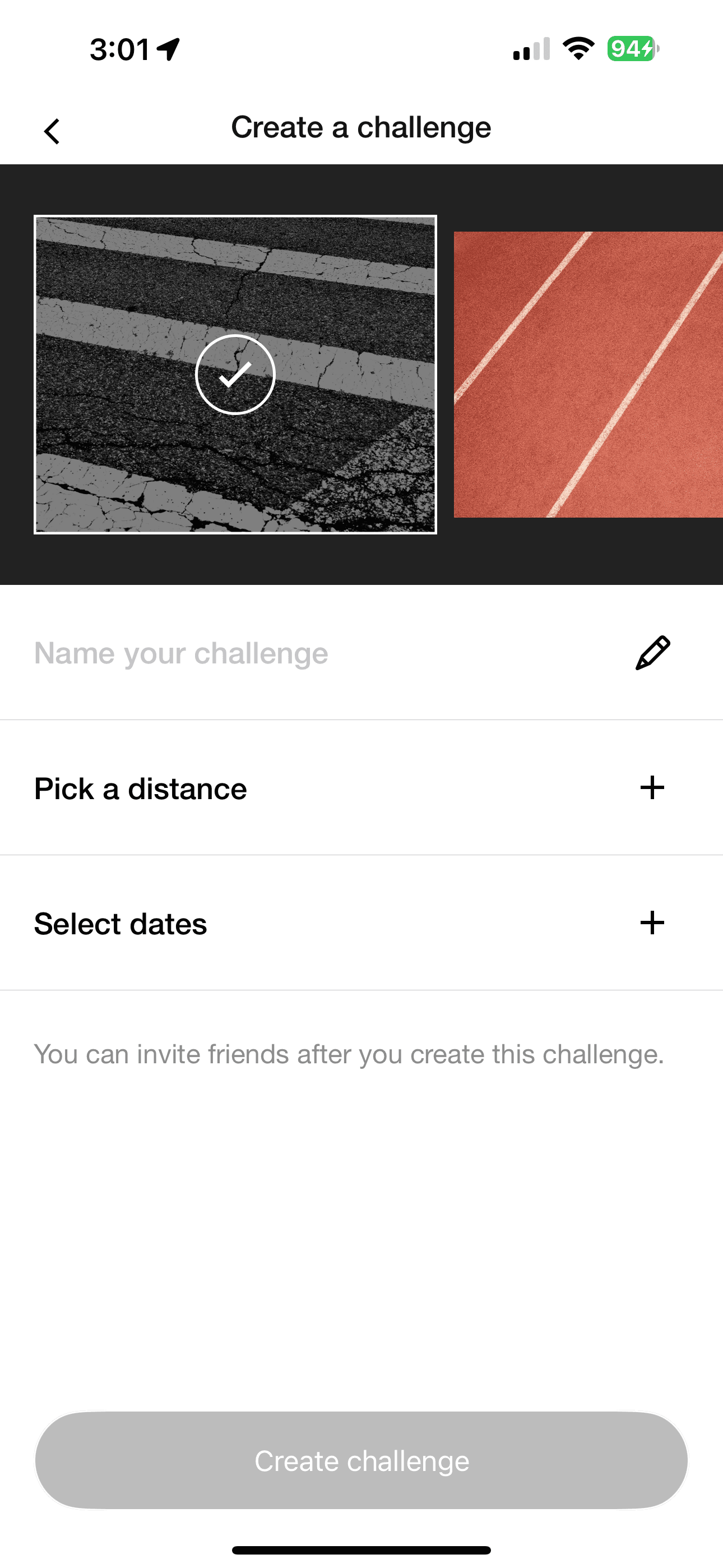
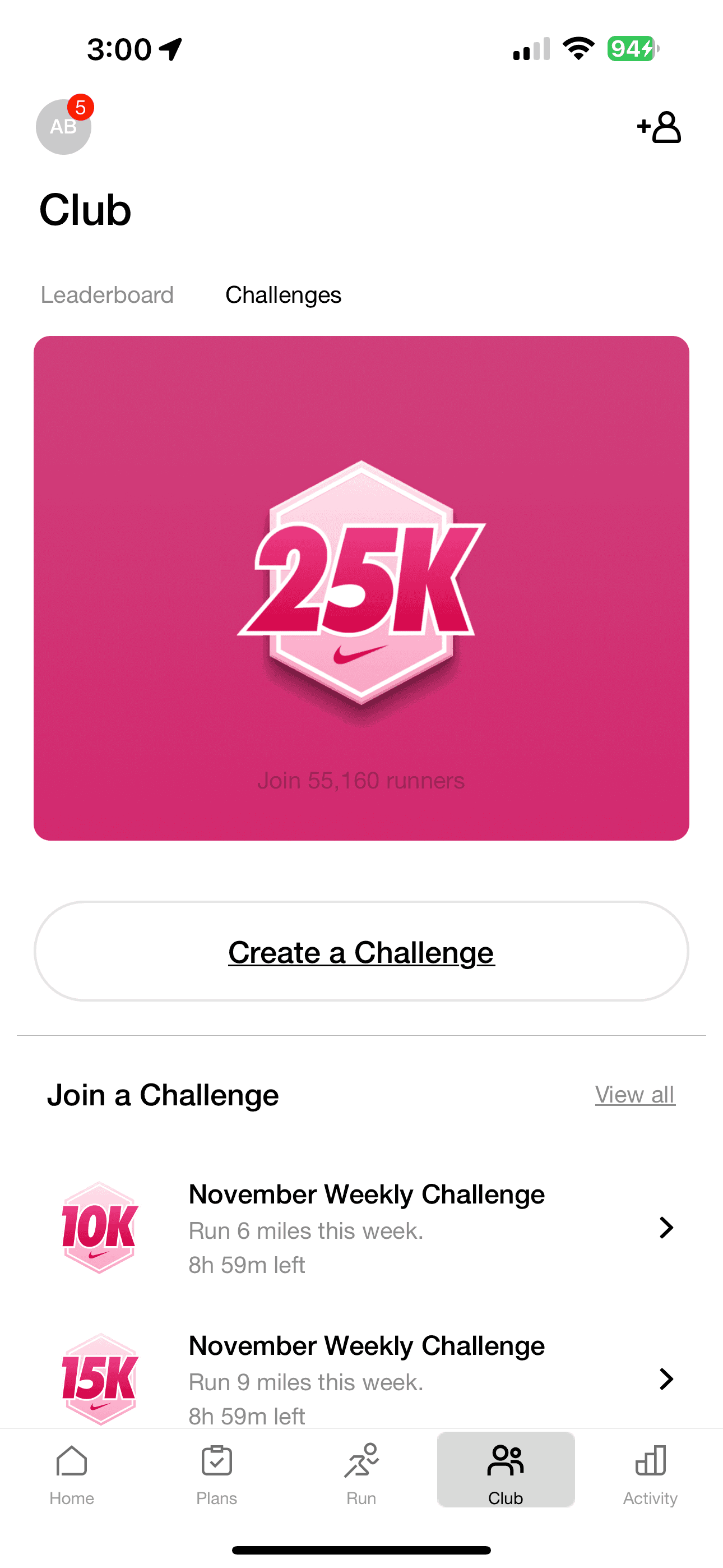
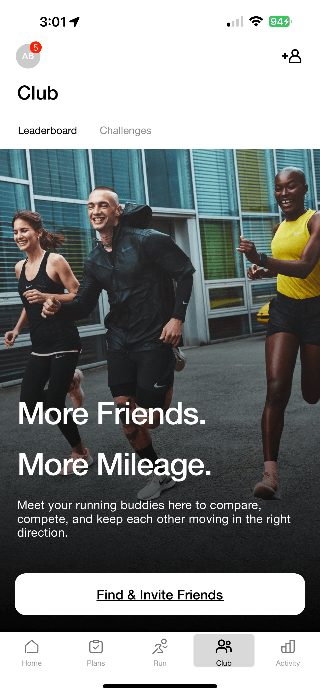
I downloaded and made user profiles on these successful mobile fitness apps in order to see how they included social features. These are some of the most popular fitness apps available, so I knew I could learn a lot from them.
GOAL
STRAVA

NIKE RUN CLUB
CLASSPASS
Strava, Nike Run Club and ClassPass all allowed users to search for friends.
Nike Run Club and Strava both featured groups and clubs as a way to connect with people both in the app and in the real world for scheduled fitness events.
search for friends
All apps have a profile for the user to personalize with a photo and a range of other information.
Strava and ClassPass both have personal inboxes for private messages from other users
Nike Run Club’s inbox is reserved for system messages.
Nike Run Club and Strava both gives their users the ability to invite other users to engage in real world fitness activities with them at a set time and place
Strava lets users set up competitive in-app events to challenge their contacts for the highest scores.
regional and national groups & clubs
LEADERBOARD & shareable achievements
customizable user profiles
personal inbox & private messaging
collaborative workouts & fitness challenges
ClassPass and Nike Run Club both have the option to post their fitness activity results and see how they measure up with a leaderboard feature showcasing the highest scores.
Existing FitFam App
Design
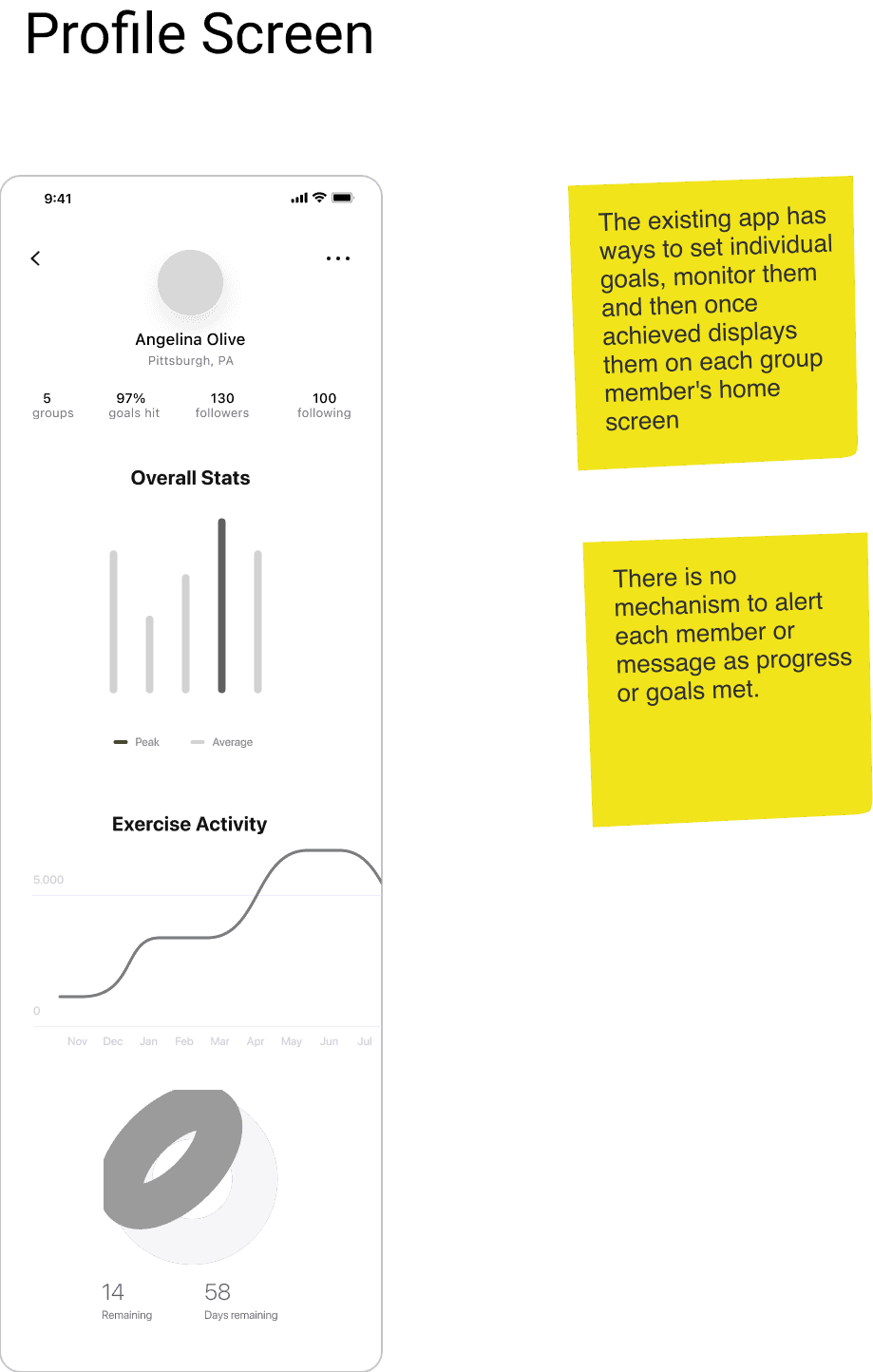
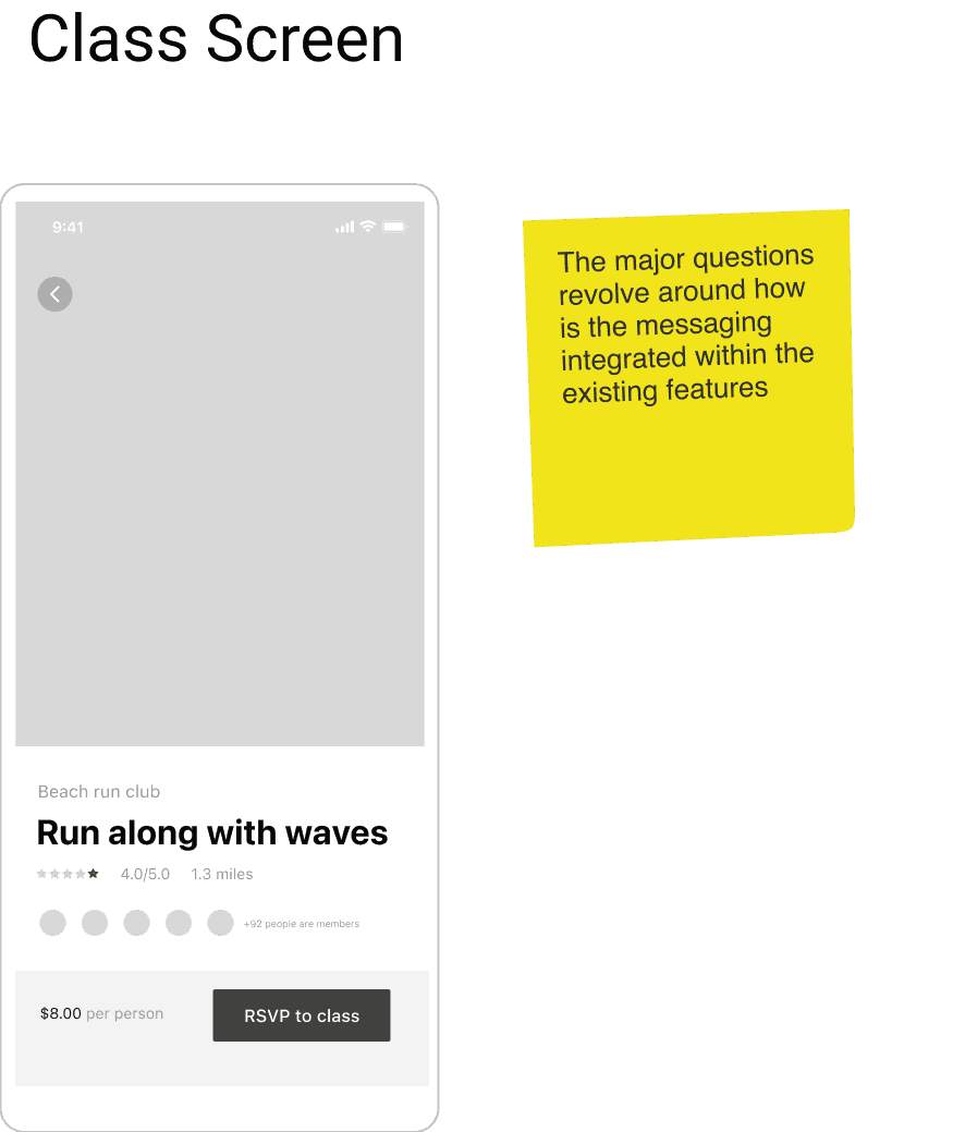
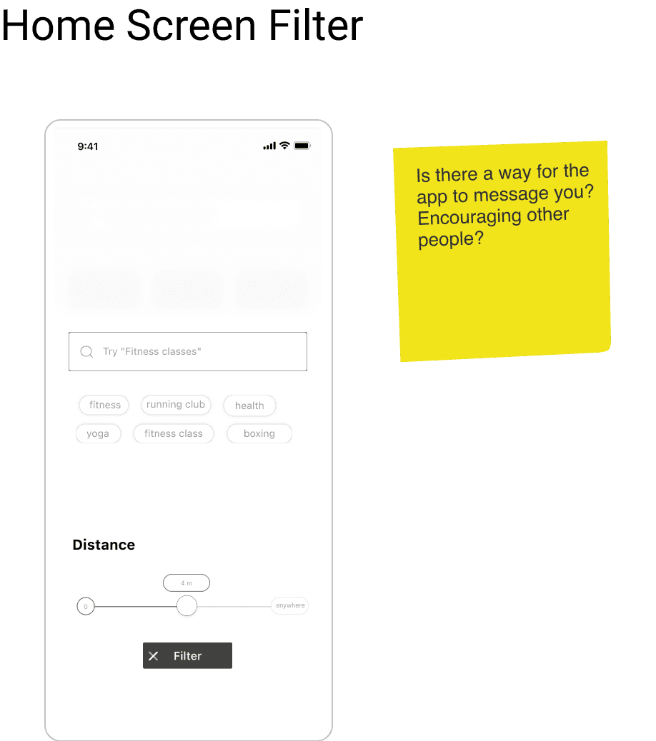
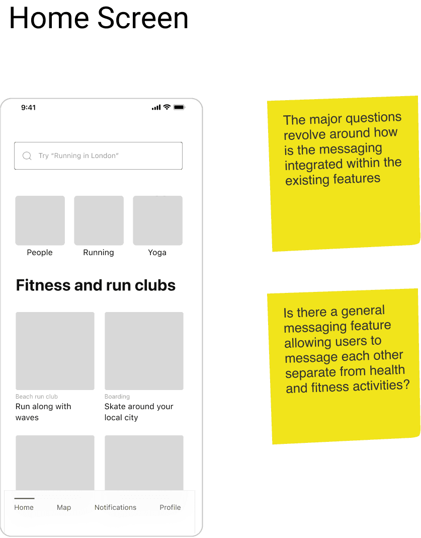
This was the information I was given in the initial brief of what the structure of the existing app was and what the company was looking for in the redesign.
Adding social feedback as progress and goals were met was paramount, but the question laid in how to integrate those features. I knew from my research that social aspects to fitness apps could indeed make a big difference in user engagement, if the social features were appealing and easy to use.
Style Guide
Design
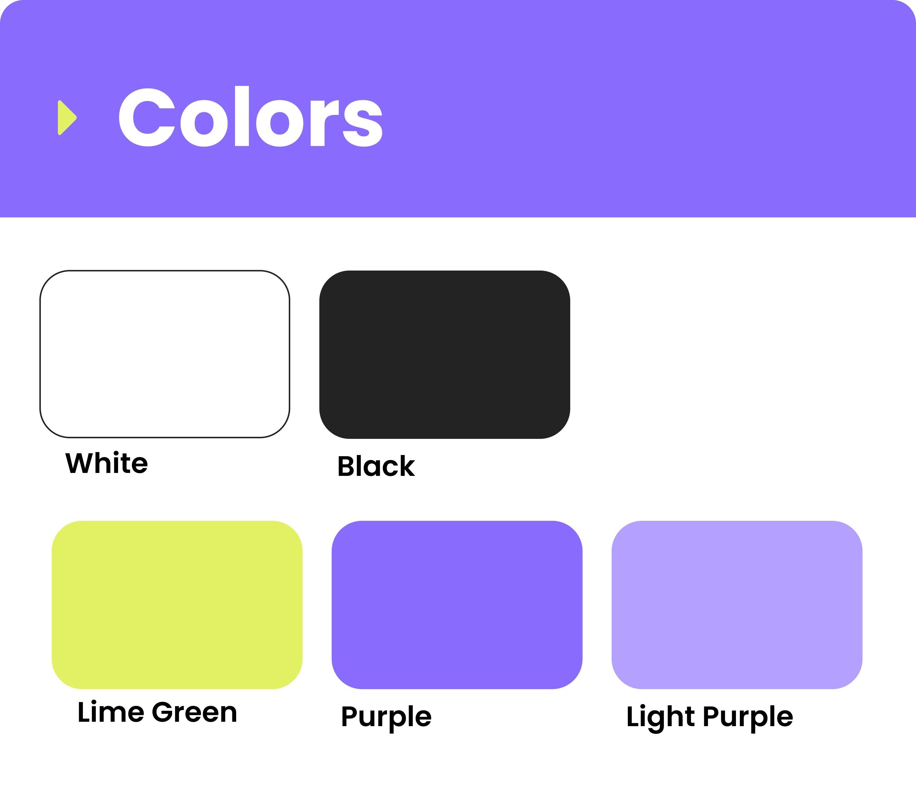
I modified a UI Kit for the general color scheme and some base icons that would make the structure of FitFam. Because of the condensed timeline of the project, this made more sense than starting completely from scratch. I designed the logo and the majority of the forms and screens myself, but kept the typography and color scheme.
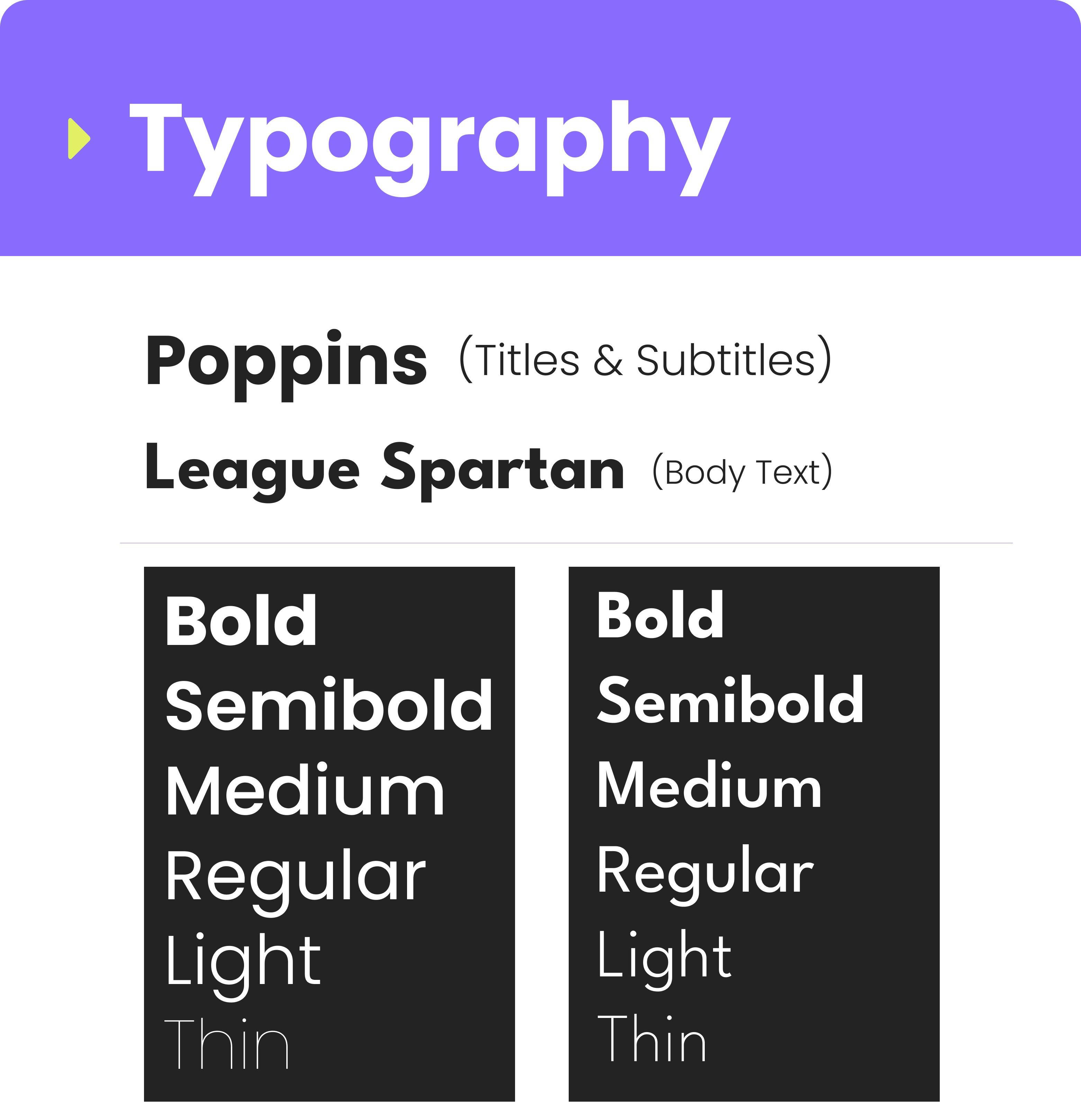
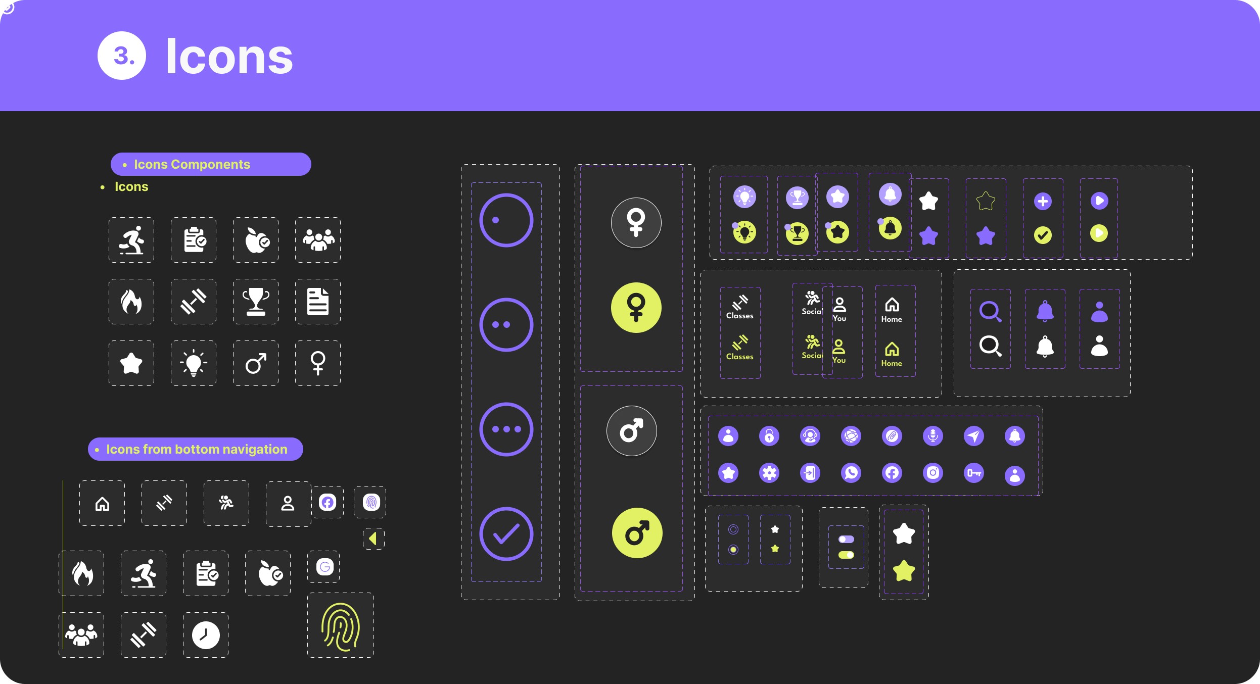
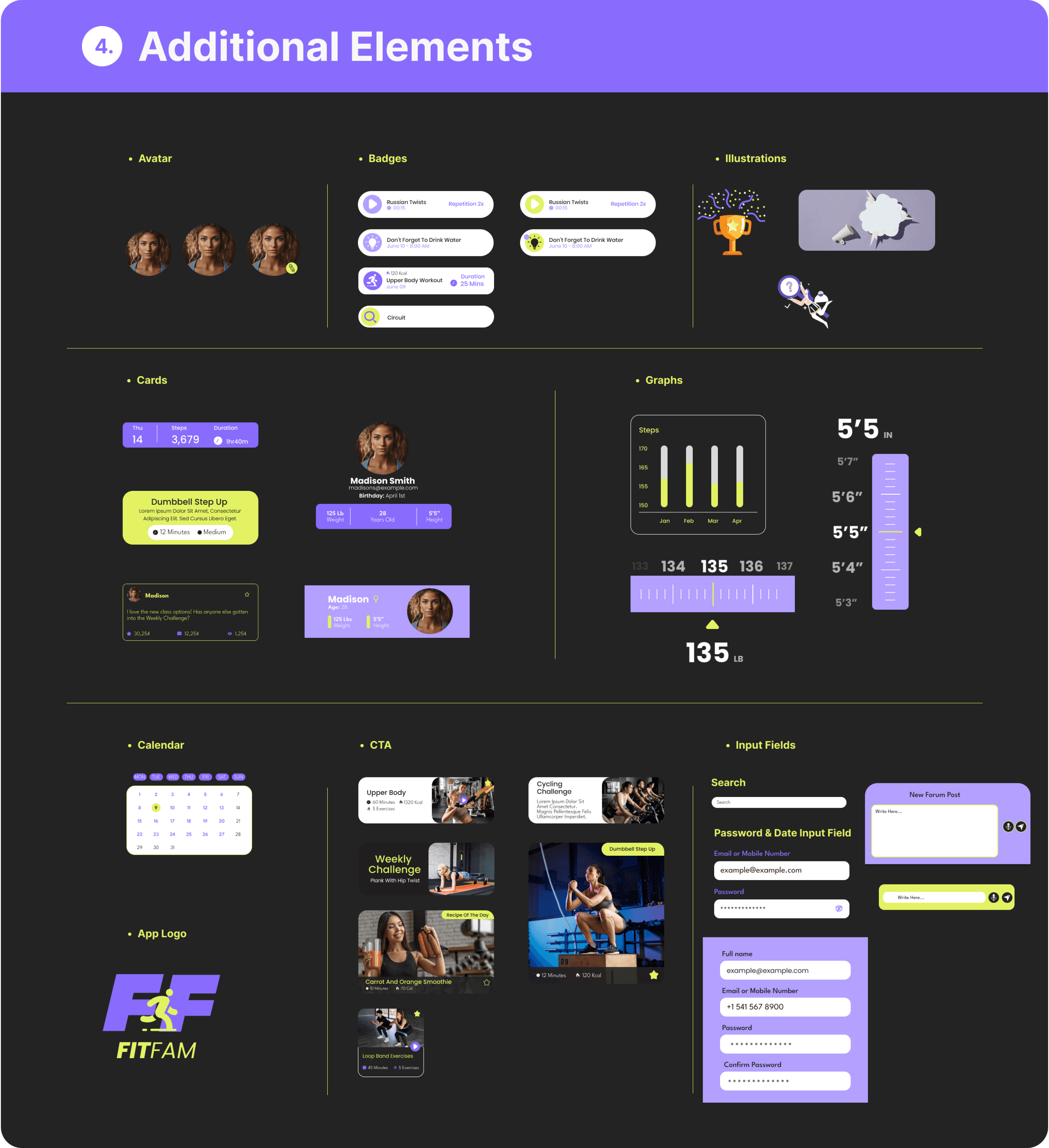
STYle guide
User Mapping Journey
Design
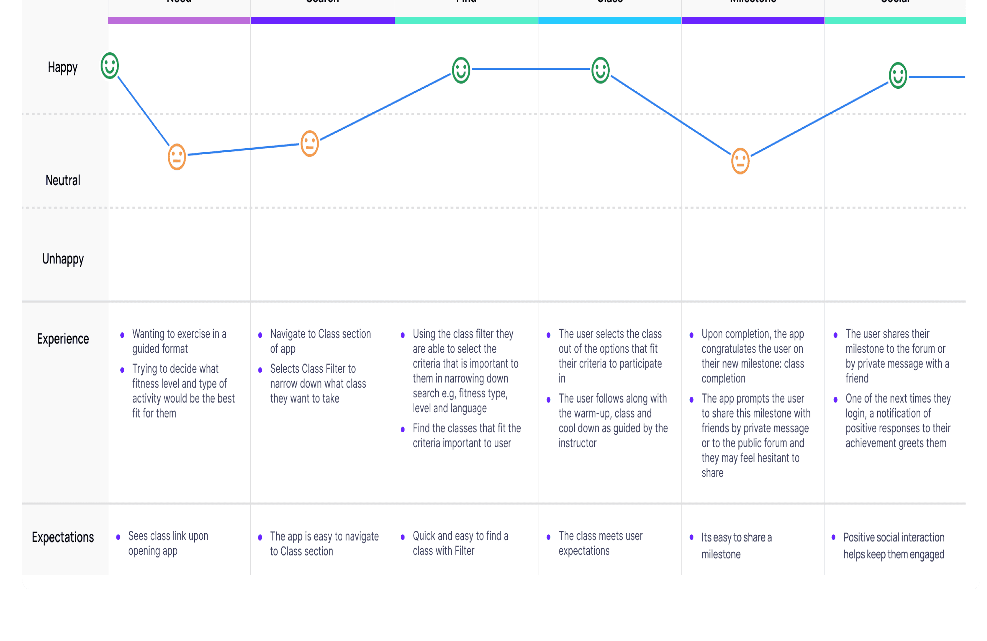
I mapped the journey of finding a class and then sharing about the milestone after, as I hoped users would appreciate this new social addition to the class taking experience for motivation and connection.
User Flows
Design
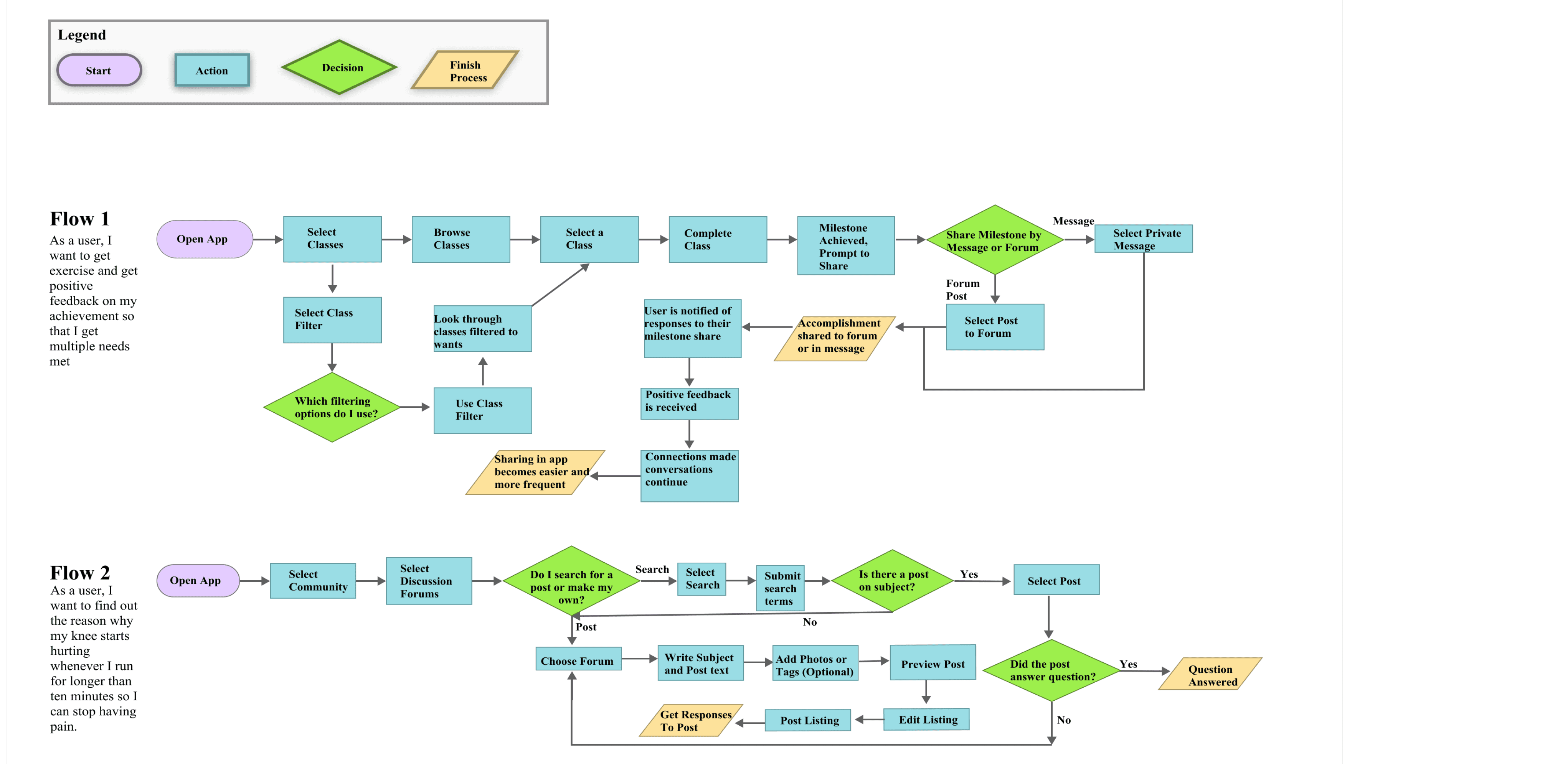
I also developed user flows to map out how users would interact with these new features in situations bound to come up for app users in the future.
Initial Sketches
Design
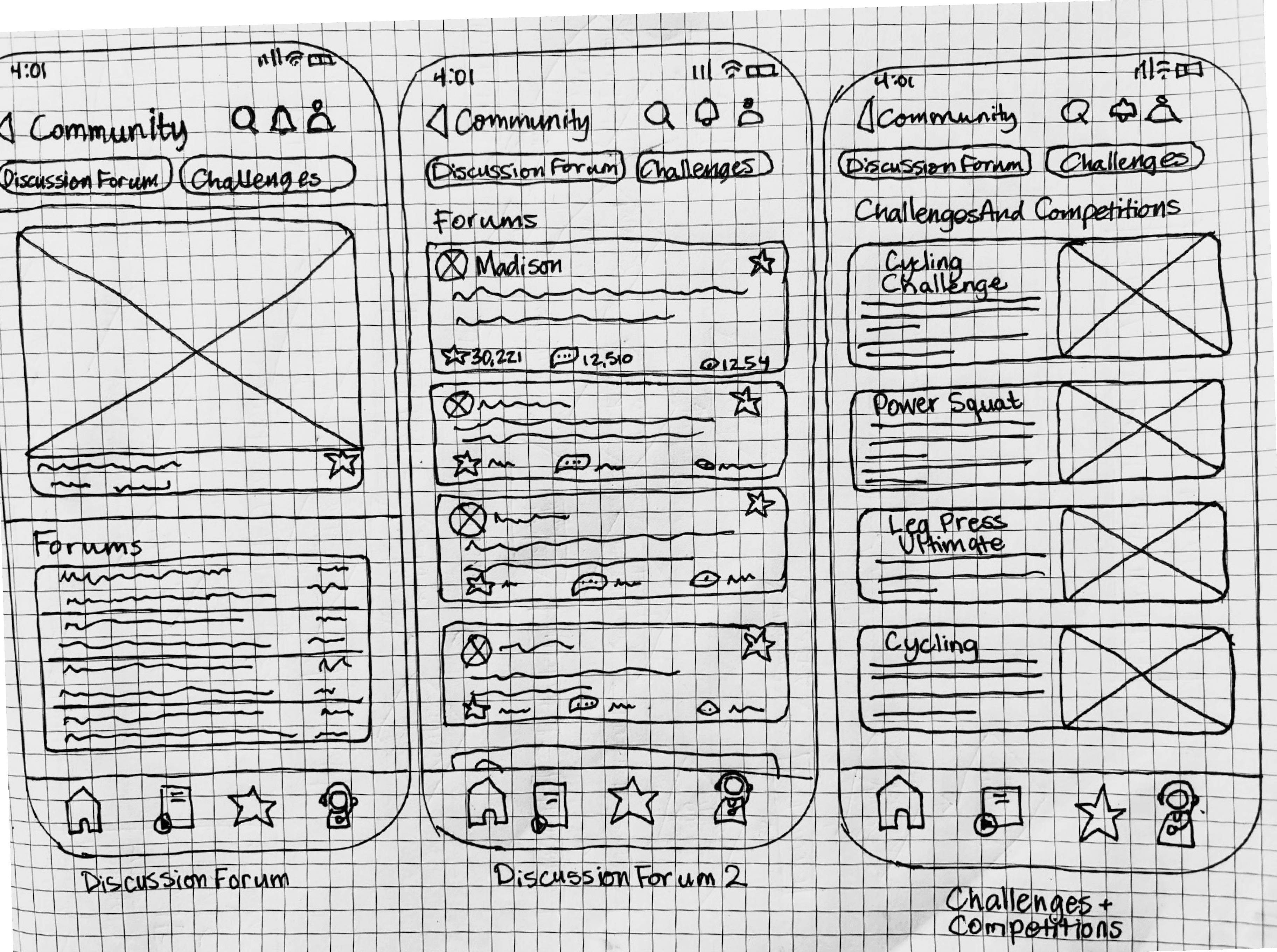
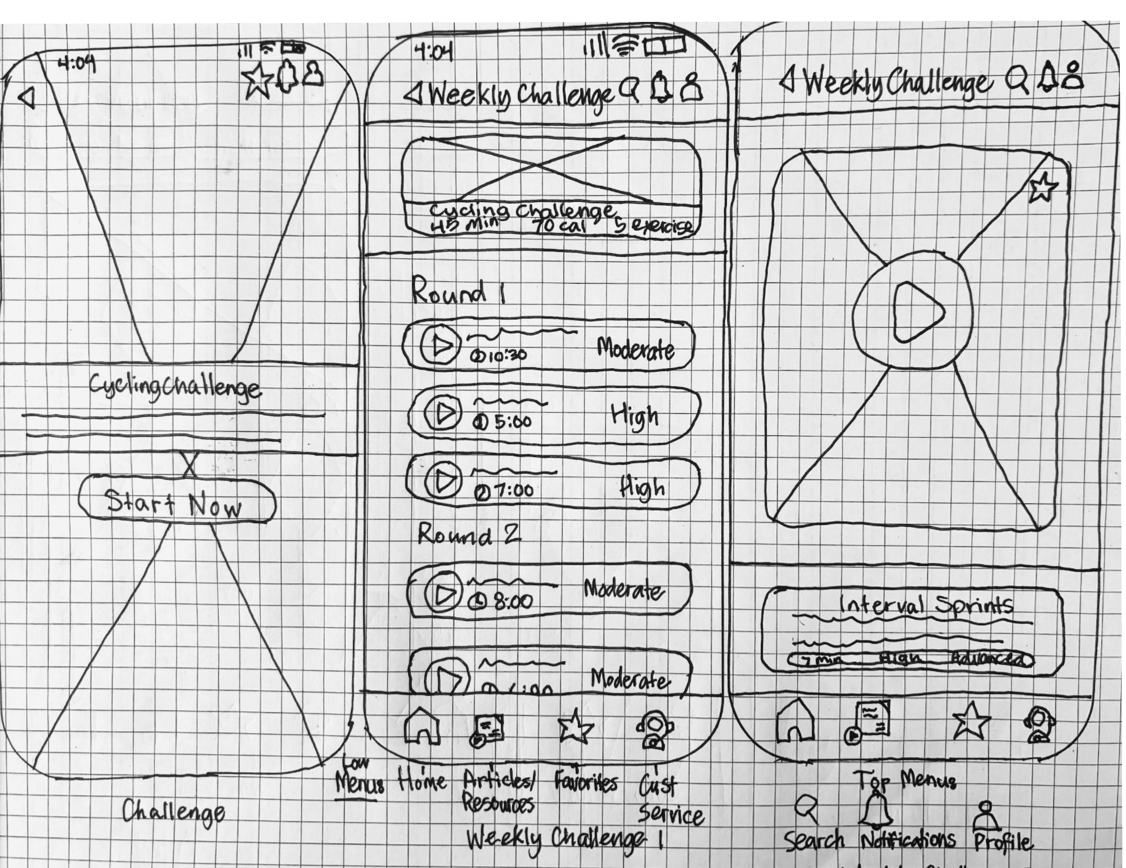
I designed low-fidelity sketches before creating wireframes in Figma, focusing on adding messaging, leaderboards, and customizable group challenges.
Alex
Usability Testing Feedback
Validate
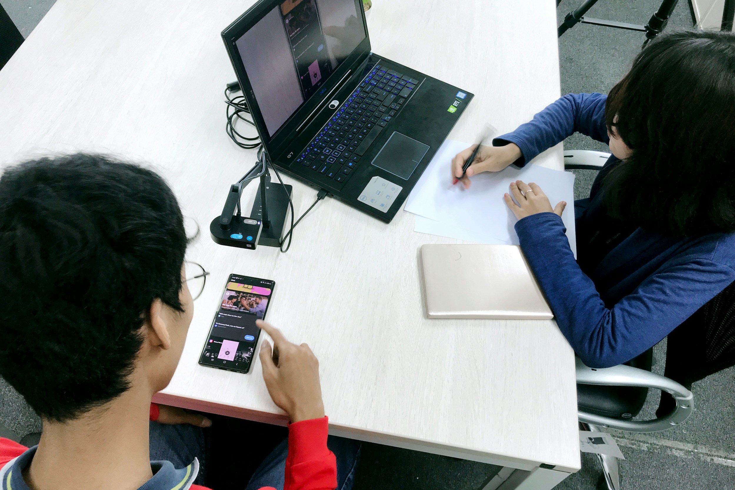
I conducted remote usability tests with five participants, to observe how they interacted with the added social features.
Usability testing was essential for identifying issues with navigation, feature clarity, and user satisfaction.
The tests revealed navigation issues with the public forum
A desire for more customization in group challenges from many testers.
Users liked the competitive elements with Leaderboards and seeing rankings
Users enjoyed connecting through Forums for questions and advice
Private messaging was appreciated for connecting with friends about more personal topics and how their workouts were going
Fitness Groups had not been expanded and needed more work
The class filter was not working and needed to be further customized
The option to make new posts to Forums needed to be added to FitFam as one of the participants noticed.
Issues differentiating between messaging to different users.
A few navigation glitches were uncovered in the prototype functioning.
Key findings
QUOTES FROM USABILITY TEST FEEDBACK
I liked the fact that there’s different classes and that you can invite different friends that are involved in different activities
Mia
I don’t see the option to post to the forum, am I missing it?
Messaging and social motivation is very important to me in a fitness app.
Richard
Usability Testing Isssues
Validate
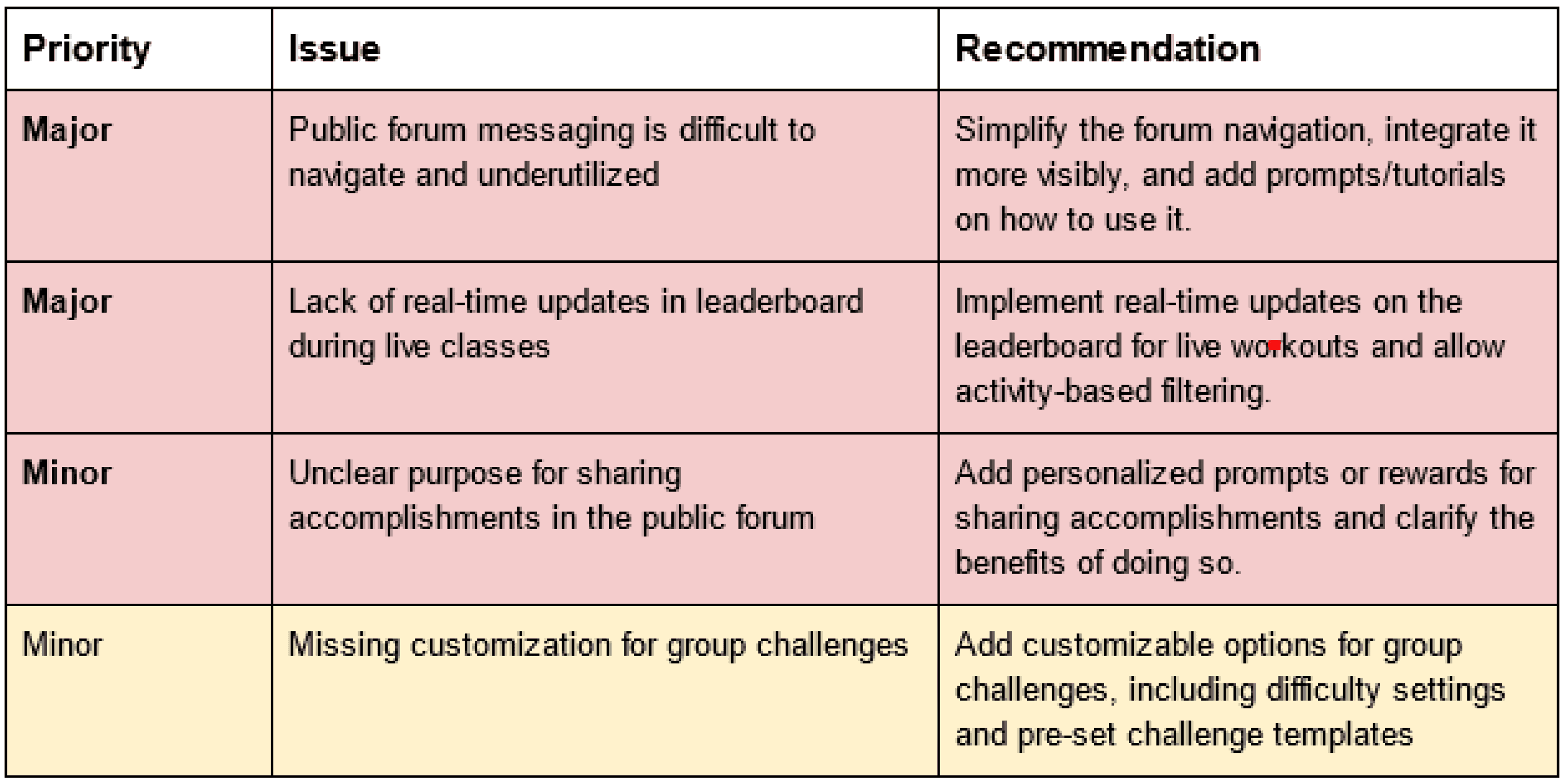
My usability test report summarized the findings of the 5 usability tests I had completed. These were the top issues which I worked on improving in my next iteration, before the next round of testing.
Validate
Before and After Wireframes
Here you can see the initial wireframes from before the usability testing and the changes made after the testing based on feedback received and usability issues which arose through the process of seeing users navigating the FitFam app. The image on the right is before and left is after.
Home before and after
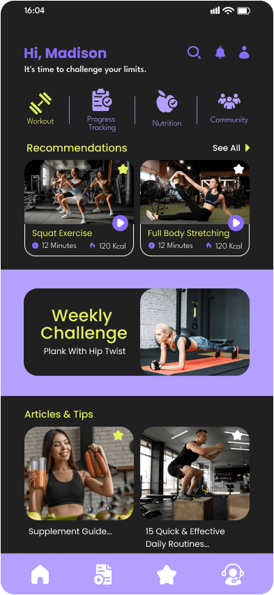


In the before Home, there was a great deal of visual focal points which felt overwhelming. In the Home redone the focus is on workout classes and fitness and run clubs, keeping the social aspect of the app at the forefront.
community/social home
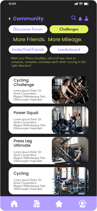

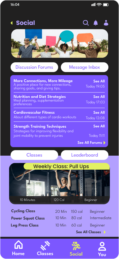

I changed the wording from Community to Social, making it clearer what the important aspect of this section is. Instead of the headings all being grouped at the top, here they are split and I removed Challenges from the upper screen in favor of the Forum and Inbox being forefront, with Classes and Leaderboard secondary mid-page.This composition feels more balanced and the groupings make more sense.
MILestone/ post workout screen
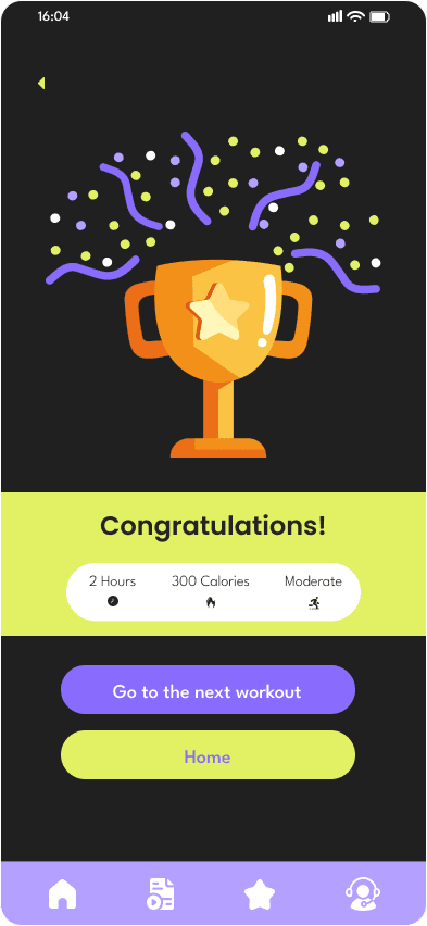

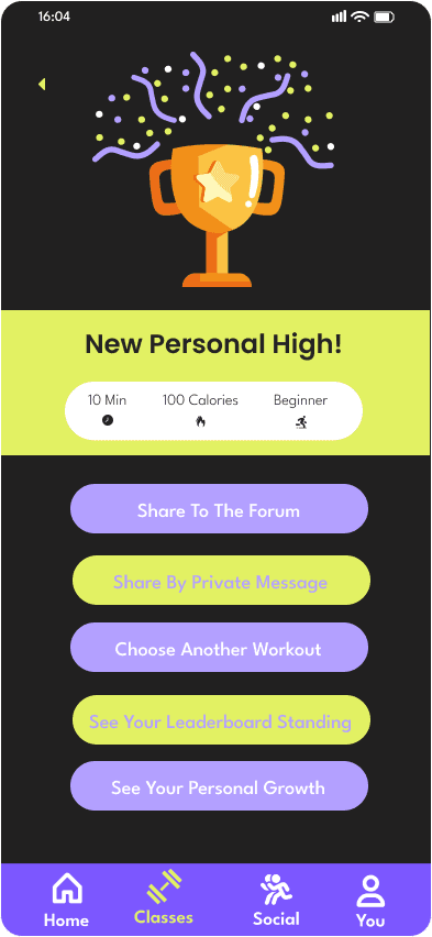

After completing a workout, Congratulations has been swapped out for New Personal High to emphasize the accomplishment achieved. The second important change is that the user is now encouraged to share their achievement in the Forum or by messaging a friend, or they have the options of seeing their Leaderboard standing or personal progress in addition to the option given before to find another work out. This encourages the social aspect to be added post-workout.
private message inbox


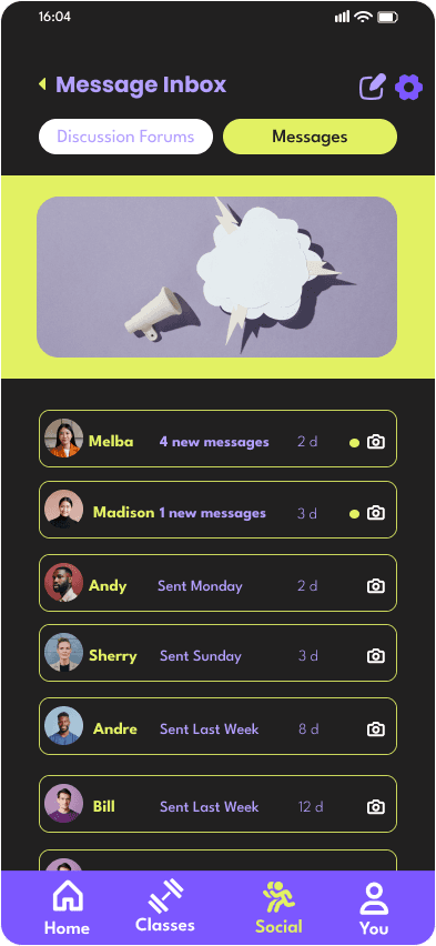

In the Message Inbox prior to Usability Testing the page was uniformly text only, aside from the user avatars. I added the option to navigate easily to the Forums from here, showing the unity in these two social communication options. I also added an image with a colored border that unites with the colors of the navigational buttons for Home and the Inbox. The page was not giving much for the user to interact with before, these elements add visual interest and unity.
public forums
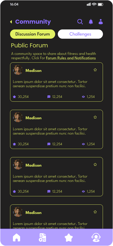

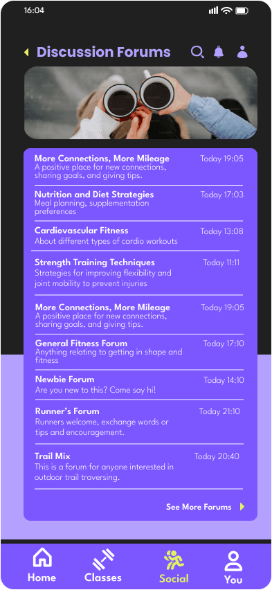

Prior to usability testing, I made the oversight of not including a page which listed Discussion Forums available to the user. The page on the right is a necessary addition, and the left page is an example of what the user would see once they clicked into a specific forum, except there would be a variety of users messaging, not just one. This was a result of time constraints and creator oversight. I fixed this error in the next iteration.
FORUM VS LEADERBOARD
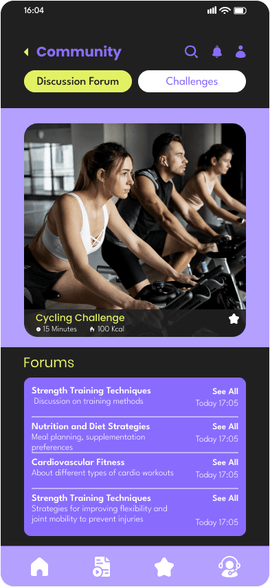

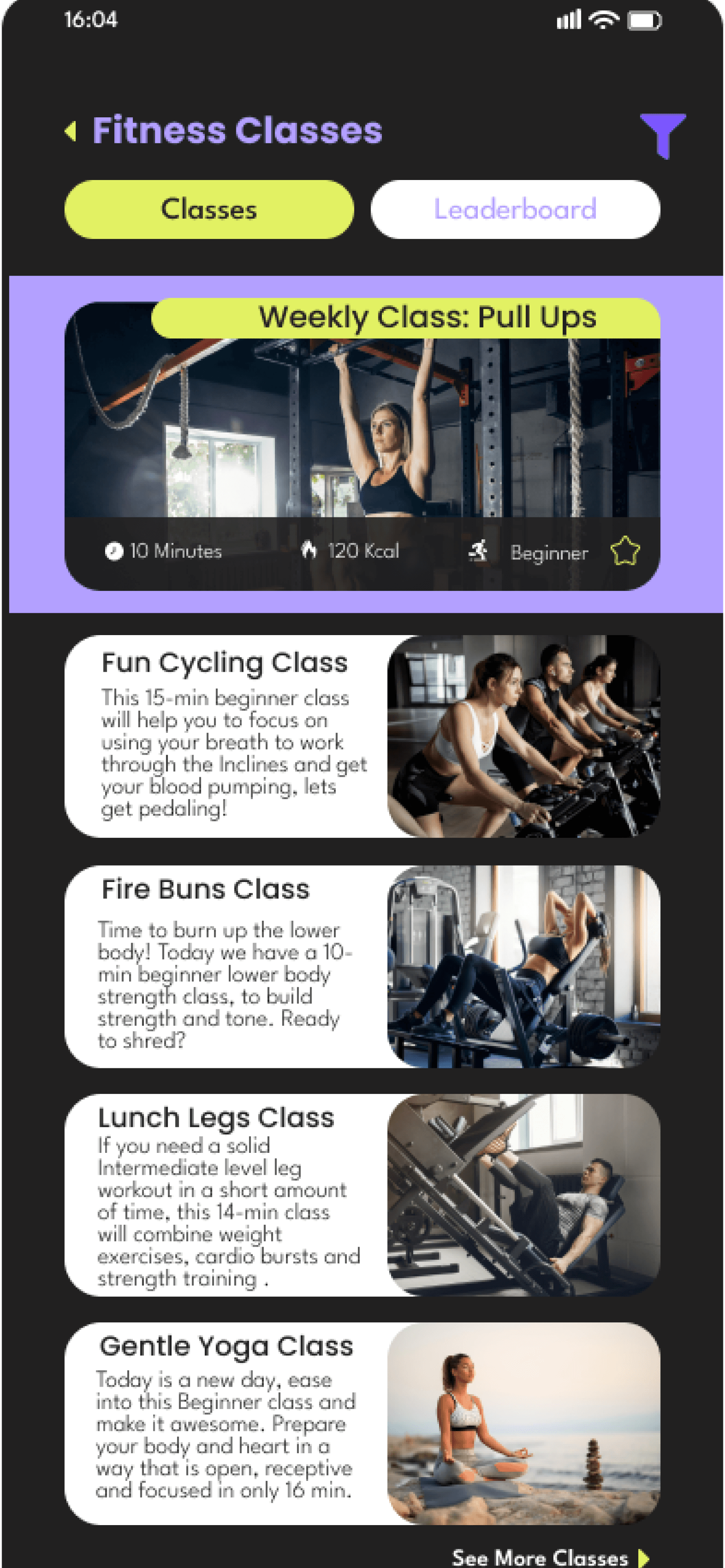

In the before Home, there was a great deal of visual focal points which felt overwhelming. In the Home redone the focus is on workout classes and fitness and run clubs, keeping the social aspect of the app at the forefront.
CLASSES BY LEVEL VS FILTERING OPTIONS
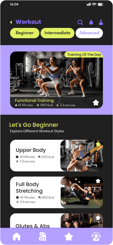

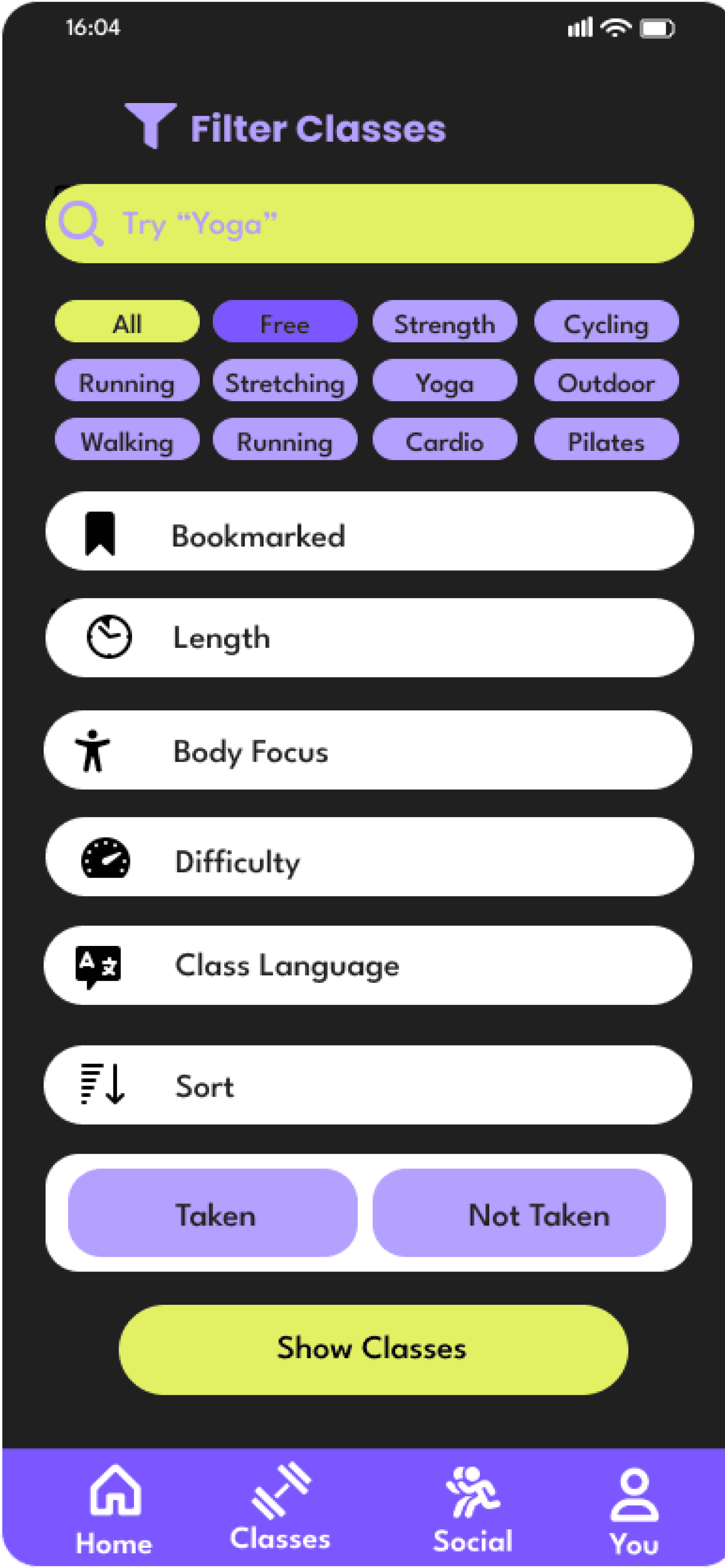

Before classes were divided into Beginner, Intermediate and Advanced. I created a filter which allowed for classes to be found based on a variety of differentiators, saving users a great deal of time looking through page after page for the fitness activity they had in mind.
Validate
Final Wireframes
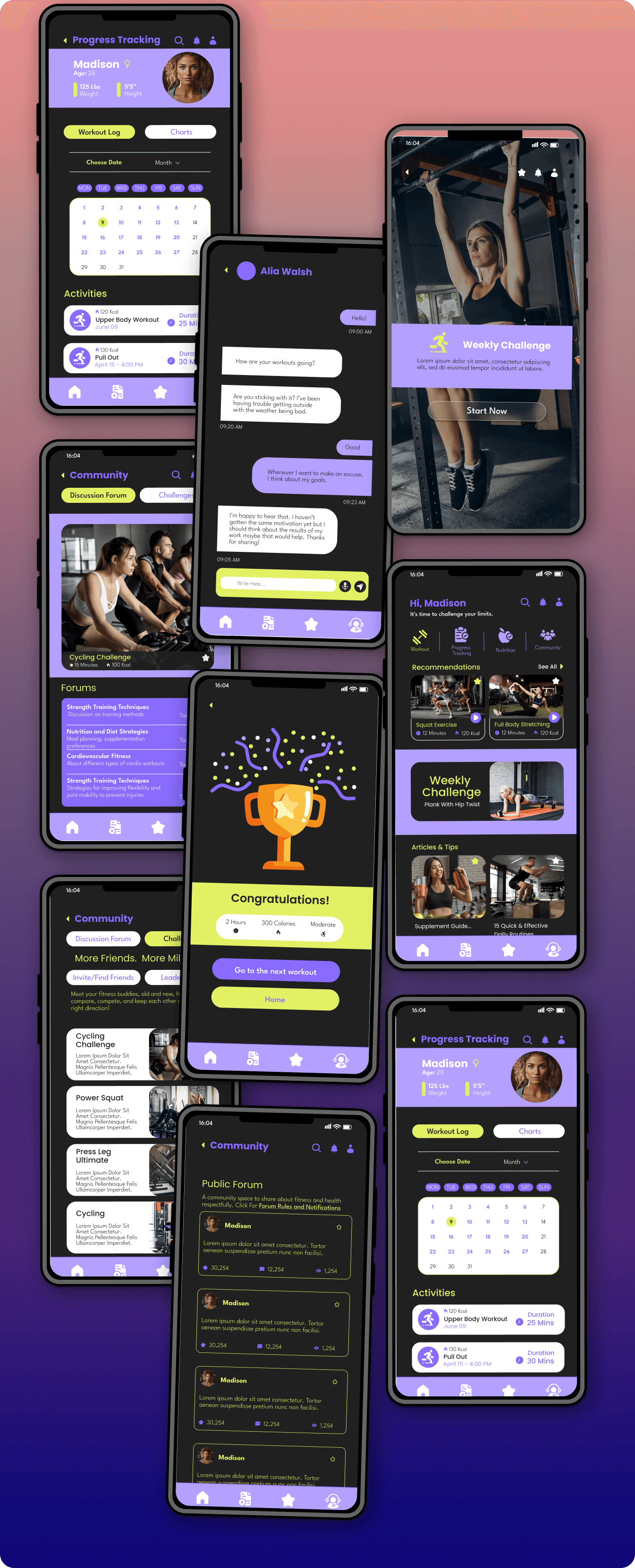
a selection of final screens from fitfam
Overall, this project gave me a great deal of practice that will serve me in future projects.
Critical thinking: Examining multiple facets of a situation, identifying key issues, and questioning assumptions.
Problem-solving: Evaluating potential solutions and choosing the most effective course of action based on the case details.
Decision-making: Weighing different options and making a justified choice
Communication and usability testing: listening to different opinions, getting feedback and applying it to the project to improve
Experience with UX processes like wireframing, usability testing, user flows, personas and practice with designing in Figma
Final thoughts
Thanks for your time! Head back Home, to Case Studies or send me an e-mail!

Try out my completed prototype below!