Duration:
June 2023- September 2023
FerretBox
Monthly Subscription App
UX Case Study
Adi Dove
Product Overview
FerretBox is a subscription service that delivers a monthly box of toys, treats, and ferret-specific products directly to ferret owners. The primary goal of this project was to create an engaging and time-saving subscription experience for ferret owners, while also catering to the unique needs of ferrets. The project focused on providing high-quality, safe, and enriching products for ferrets, delivered conveniently to the door of the owners once a month.
Responsibility
UX Designer
UI Designer
UX Researcher
Tools
Figma
Miro
Google Docs
Google Slides
Google Forms
Social Media
Problem Statement
How might we save time for busy ferret owners?
How might we reduce ferret boredom and prevent the issues that arise from it?
How might we select high quality items that cater to the specific needs and preferences of ferrets?
How might we design a service that sparks excitement and engagement for both ferrets and their owners?
Solution
To fight ferret boredom it is proven that varied environmental enrichment is necessary. For all of these reasons ferrets are uniquely suited to a monthly subscription box model. Ferret owners will save a great deal of time searching for quality products, have peace of mind knowing the products they will receive are safe, healthy and stimulating for ferrets, and ferrets will have access to a variety of varied enrichment each month. Subscribers will experience fewer behavioral issues from their ferrets as they have kept boredom at bay. A study performed on ferrets who spent just an hour of exploration time with access to varied environmental enrichment outside of their cage was enough to dramatically decrease all of the negative behavioral indicators of boredom in those ferrets for up to 24 hours following their hour of interesting playtime.
Design Process
Understand
Define
User Persona
Jobs to be Done
User Journey Map
Ideate
User Flow
Information Architecture
Design
Wireframes
Hi-Fi Designs
Prototype
Test
Usability Testing
Reiteration
Final Prototype
Screening Survey
Created a plan to move forward and recruited participants using a screening survey. Link to survey here
• Posted the survey link in ferret-focused social media communities on Facebook and Reddit to gather demographic data and find people who fit criteria of potential subscription service users willing to speak to me for 30 min interviews.
•Found five ferret owners willing to participate in interviews via Zoom or Skype, meeting screening qualifications.
Challenges:
•Many potential participants were no-shows or canceled last minute due to lack of compensation.
•Took nearly three months to secure five participants, which significantly delayed the project schedule.
Importance:
•Highlighted the difficulty of recruiting participants without offering incentives, affecting the timeline and success of user research.
•Underscored the importance of budgeting for participant compensation to ensure higher participation rates and adherence to project timelines.
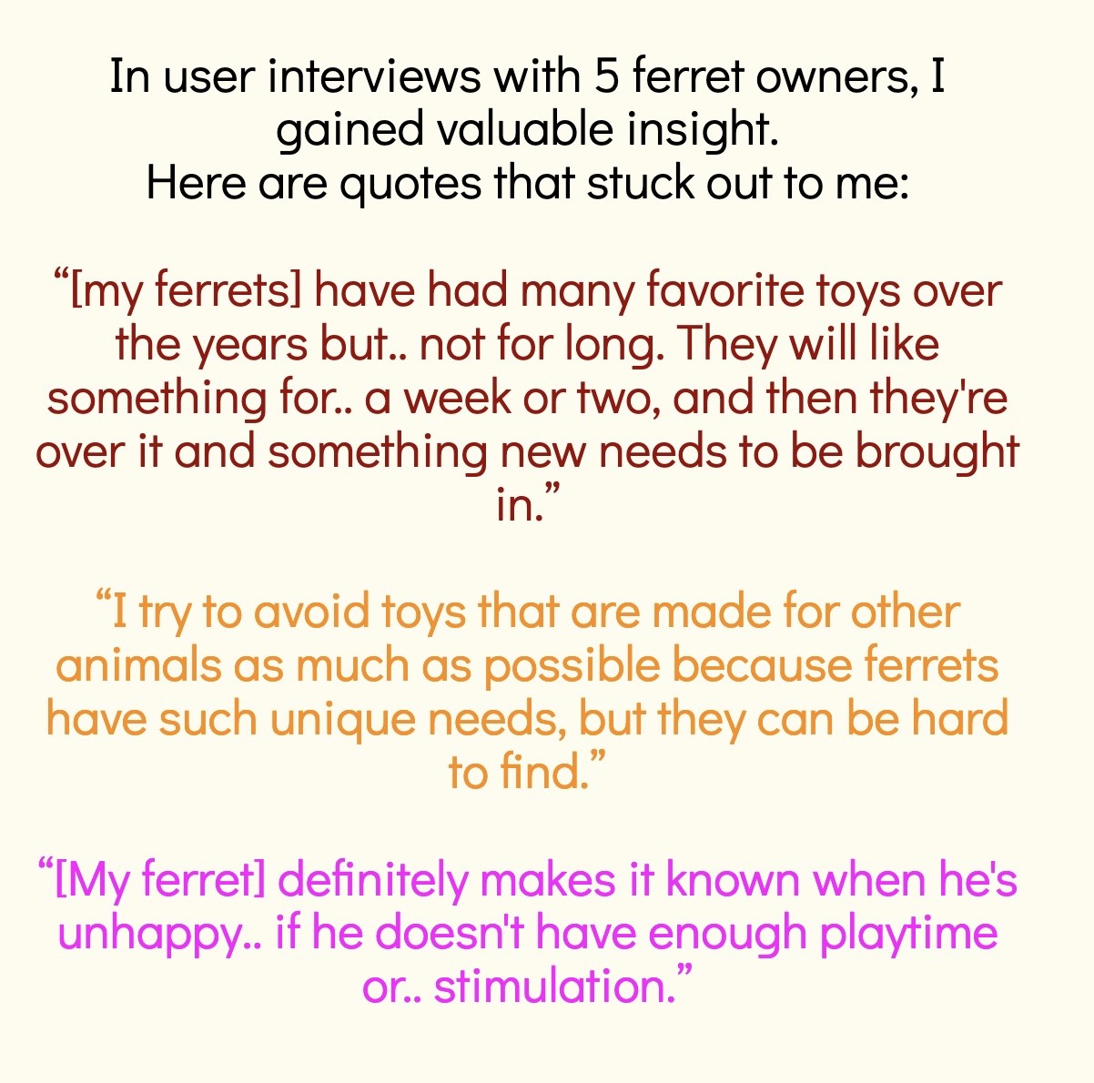
•Conducted interviews with five ferret owners to gather insights into their needs, frustrations, and preferences.
•Created a Discussion Guide (available here) to give uniform structure to the 30-minute interview with each of the respondents and gather meaningful data.
•Goal: Understand the core pain points of ferret owners and determine how a subscription service could best meet their needs.
Importance:
•Gained direct user insights critical for shaping a user-centered subscription service.
•Helped identify specific pain points and areas where the service could add value.
•Using a structured Discussion Guide ensured consistency and focus in collecting valuable insights.
User Interviews
Data Analysis
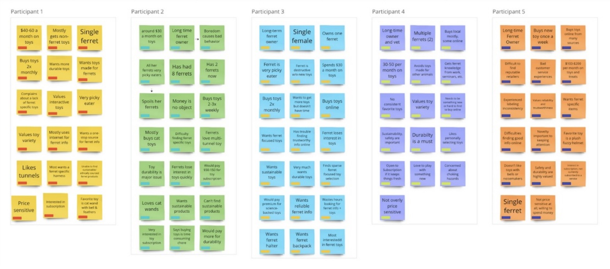
•Used Miro to jot down key points from each interview as virtual post-it notes.
•Grouped insights into related clusters to make sense of the data and uncover patterns.
Importance:
•Helped organize data in a meaningful way, making it easier to identify recurring themes and user priorities.
•Enabled a structured analysis of interview findings, ensuring that no critical insights were overlooked.
Key Insights from Interviews
•Variety in toys and focus on health and safety were top priorities for respondents.
•Keeping ferrets entertained was a major challenge.
•Most respondents were frustrated with conventional products, which did not meet their ferrets’ unique needs.
• All respondents wanted safe, healthy products and wished they could avoid spending so much time searching for quality items.
• Expressed interest in a subscription service that could relieve the burden of hunting for products, though the price of the subscription was a key factor.
Importance:
•Confirmed the need for a customizable subscription service focused on variety, health, and safety.
•Identified boredom and lack of suitable products as major pain points.
•Highlighted the importance of an economical solution for ferret owners.
Affinity Mapping for Data Synthesis
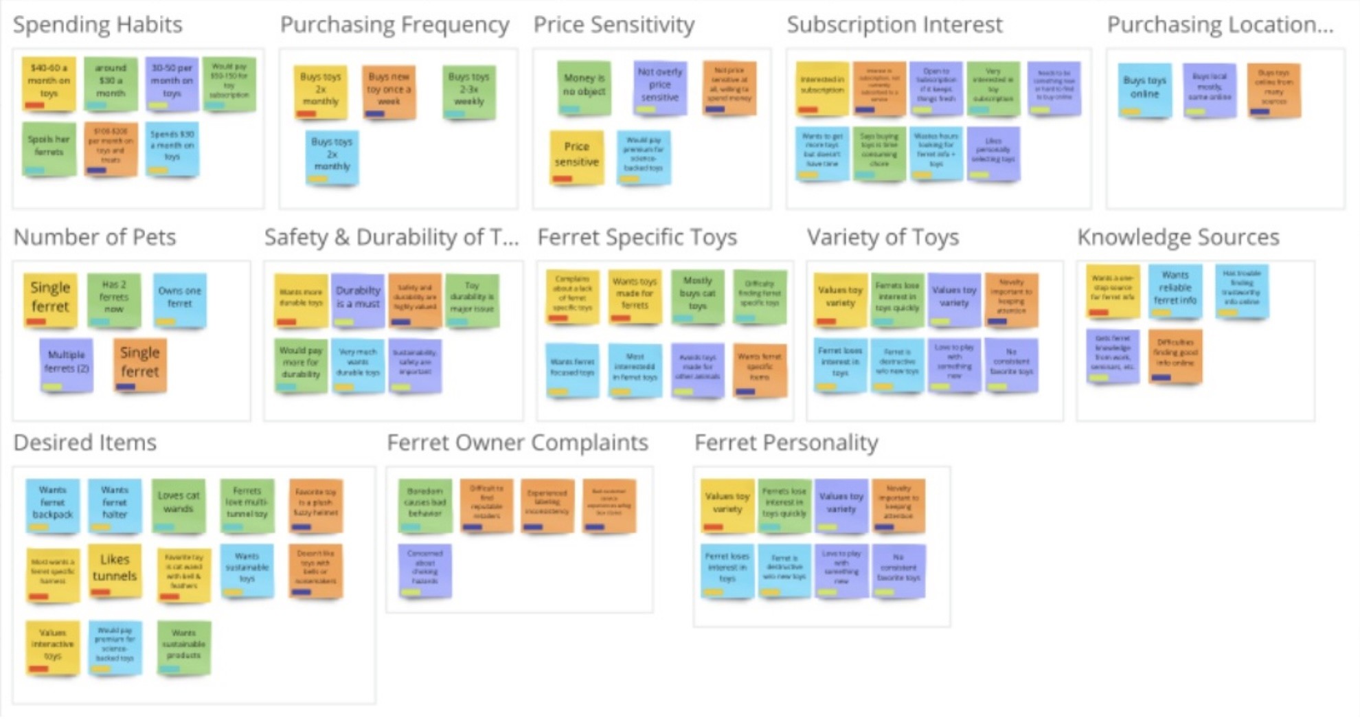
•Used affinity mapping to sort and categorize interview data into themes, making it easier to guide the project’s development.
Importance:
•Organized complex data into actionable themes, helping to ensure that the subscription service addresses the most important user concerns.
•Informed the project direction by clarifying user needs and expectations for the product.
Below are the two steps of my process Affinity Mapping in Miro, first grouping main points by Participant and below that, regrouping by recurring themes.
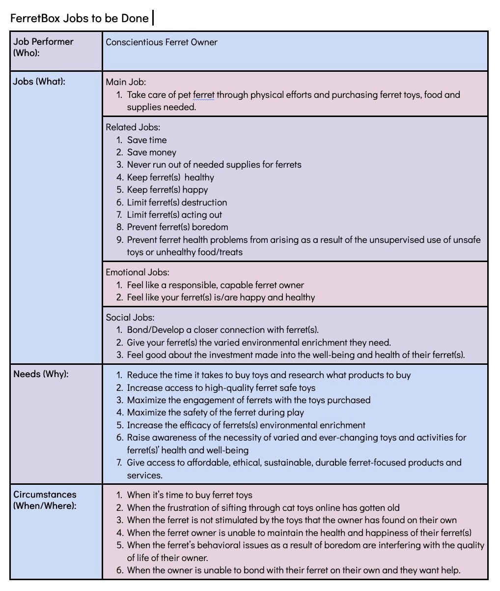
Jobs to be Done (JTBD) is a framework in product development that assumes people buy (“hire”) products to accomplish a particular goal (“job”). This framework helps product and marketing teams understand why consumers buy the products they do and how to create a product that effectively meets customer needs. Below you can see the main needs FerretBox fulfills for its users.
Jobs to be Done (JTBD) is a framework in product development that assumes people buy (“hire”) products to accomplish a particular goal (“job”). This framework helps product and marketing teams understand why consumers buy the products they do and how to create a product that effectively meets customer needs. Below you can see the main needs FerretBox fulfills for its users.
Jobs To Be Done
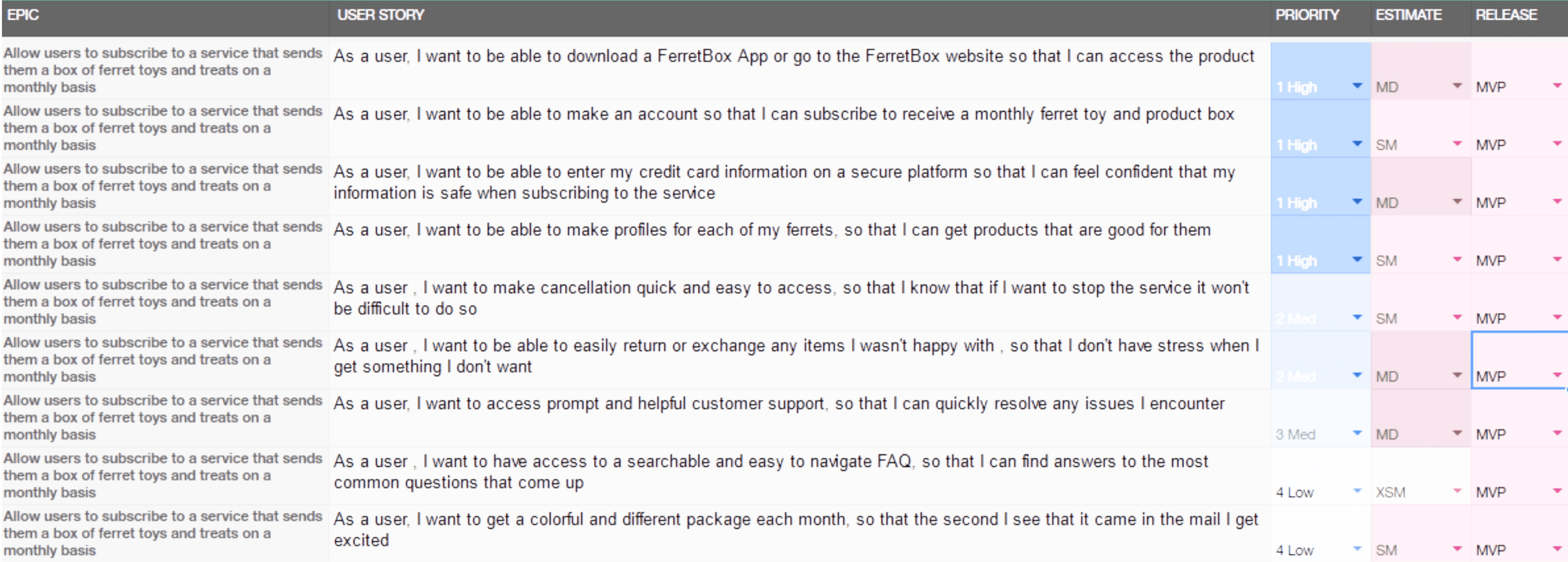
User story mapping is a tool that can help teams create a Minimum Viable Product (MVP) by identifying user stories and core functionalities:
User story mapping
A process that breaks down the user journey into individual user stories to identify core goals and functionalities.
User story maps depict activities, steps, and details.
Minimum Viable Product (MVP) is an early version of a product that includes only the essential features to gather user feedback and test the product's core hypothesis. The goal of an MVP is to reduce costs, expedite development, and mitigate risk.
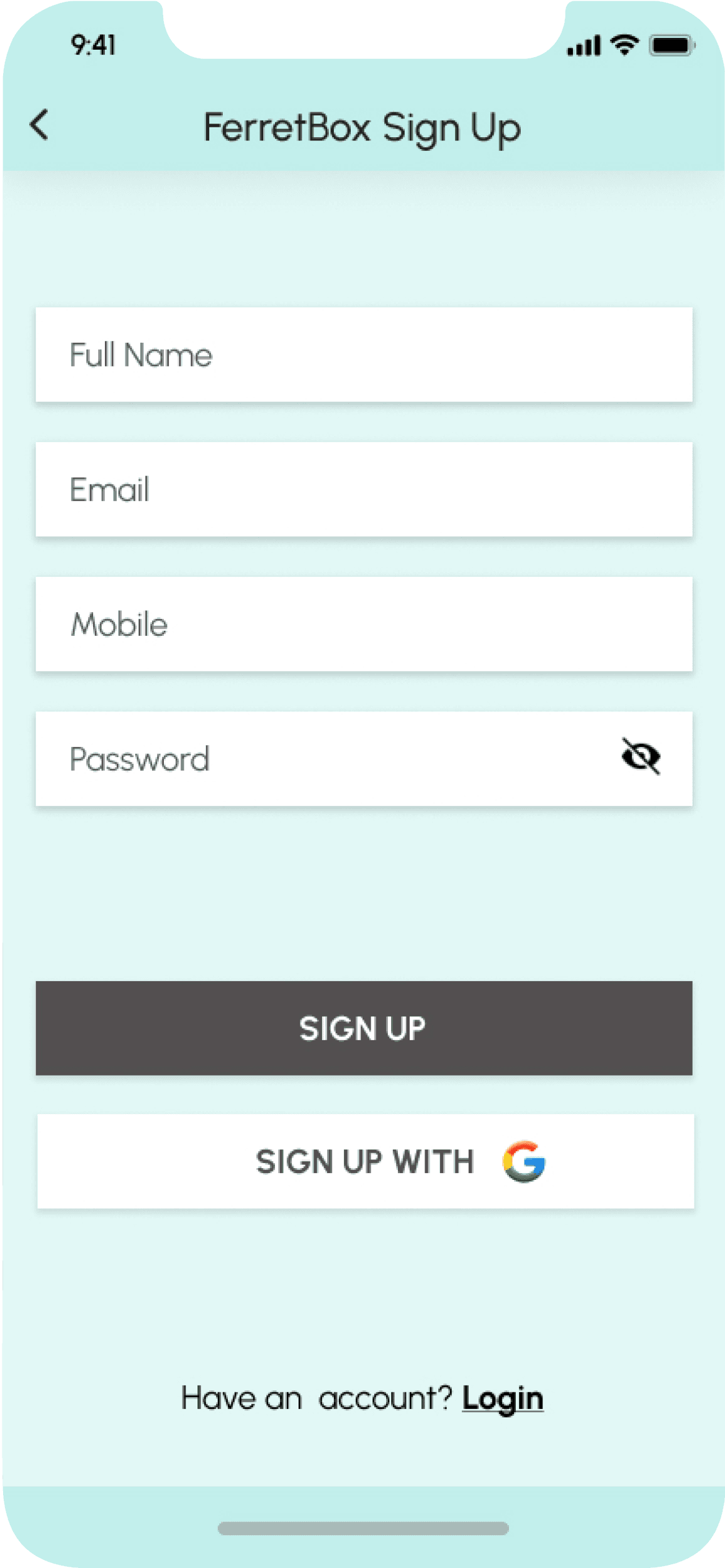
User story mapping helped me to focus on delivering value to users and building a functional product that meets core needs. I prioritized making the sign-up process easy, secure and personalized for ferrets. The feedback I received in my research is that ferret health and wellness is the most appealing aspect of the service. I learned that subscriptions can make people leery if they feel like they will have problems cancelling later or if they do not trust the interface. For that reason I prioritized that the platform be secure and easy to use, and that the sign-up process was brief and to the point. You can see in the table below the user stories which I decided to include in the initial release, or in my case the first working prototype.
User Story MVP
User Persona
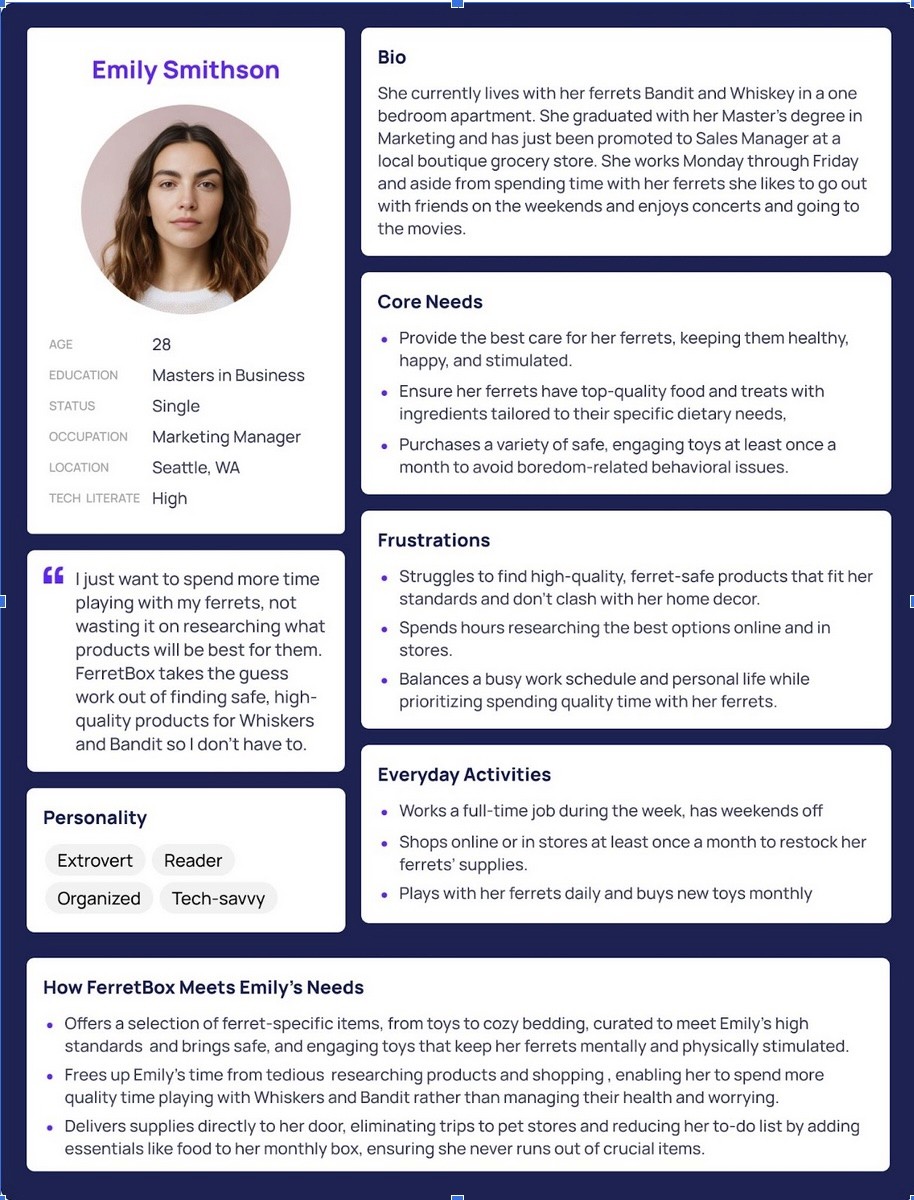
I created a detailed persona for Emily Smithson, a typical busy ferret owner, to guide design decisions. This helped me to ensure the design was aligned with the real needs and pain points of our target users. Emily became a central focus of the project, helping prioritize ease of use and high-quality products in the subscription experience. Having this user persona grounded the design decisions and helped align the project in user needs.
Site Map
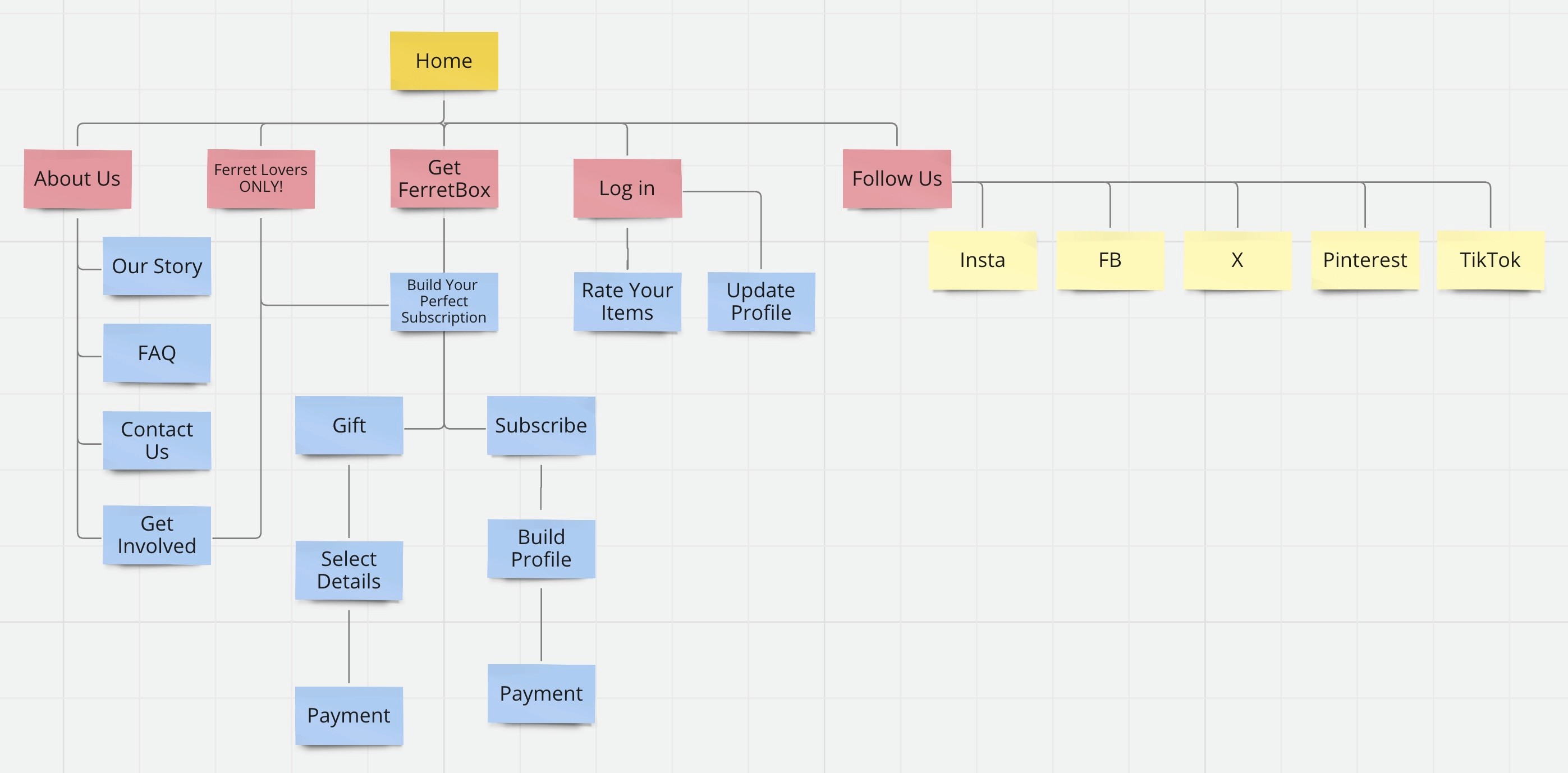
A sitemap is a visual representation that allowed me to keep track of all of the different screens within the FerretBox app and visualize how they are all connected. This helped me to keep track of all of the screens I would need to design. You can see my initial sitemap, created in Miro, below.
A sitemap is a visual representation that allowed me to keep track of all of the different screens within the FerretBox app and visualize how they are all connected. This helped me to keep track of all of the screens I would need to design. You can see my initial sitemap, created in Miro, below.
Site Map
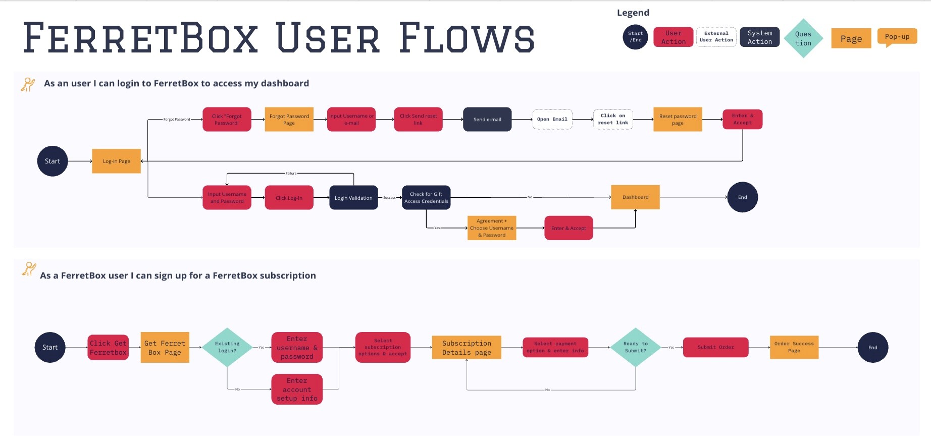
A user flow is a visual representation of a specific route that a user might take through your site or app to achieve a goal. Red routes are the user flows that are critical to your design, in my case logging into the app to access the dashboard and signing up for a FerretBox subscription. Creating these user flows helped me to stay on track when prototyping my design. You can see my red route user flows, created in Miro, below.
User Flows
Initial Sketches/Low-fidelity Wireframes
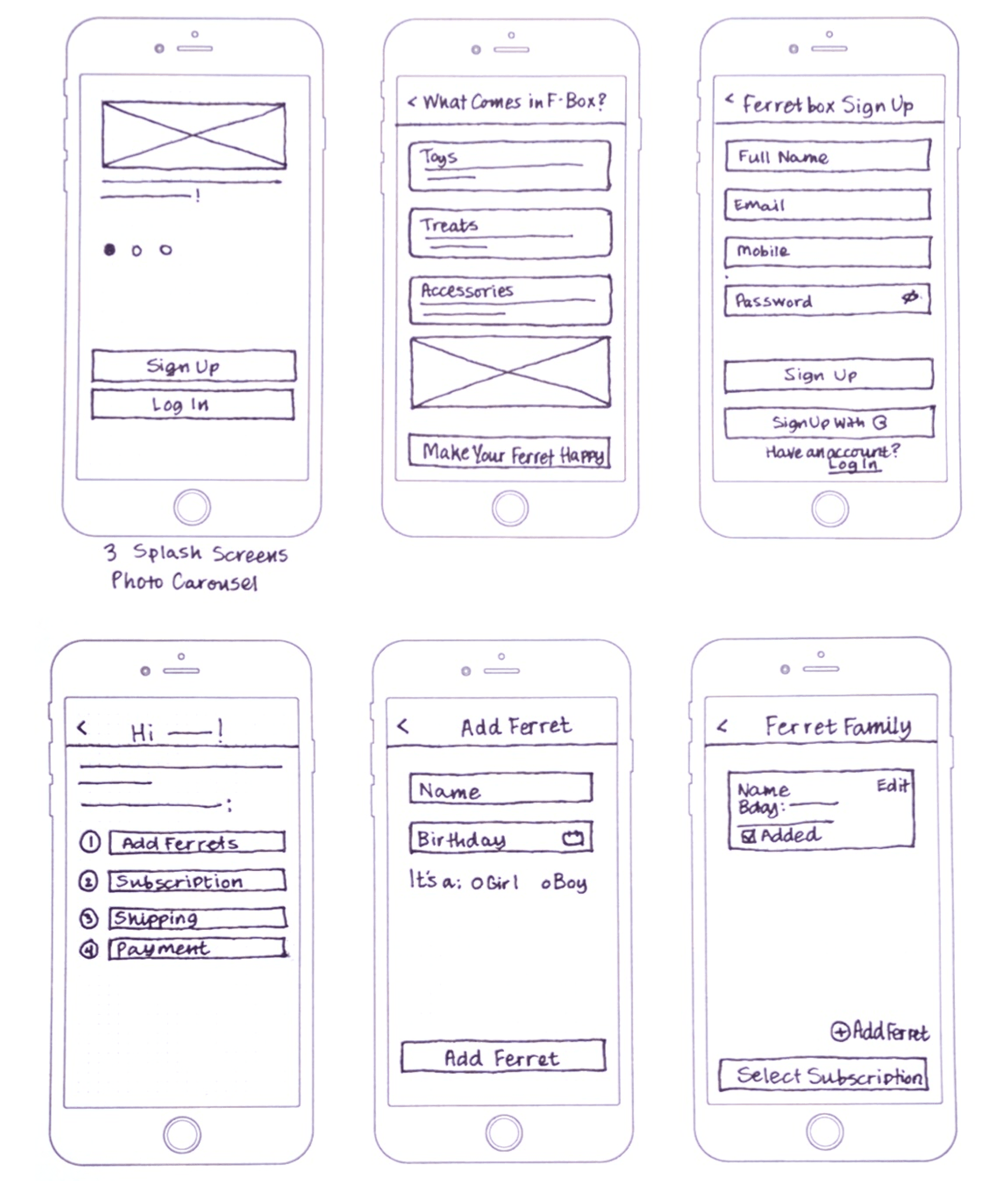
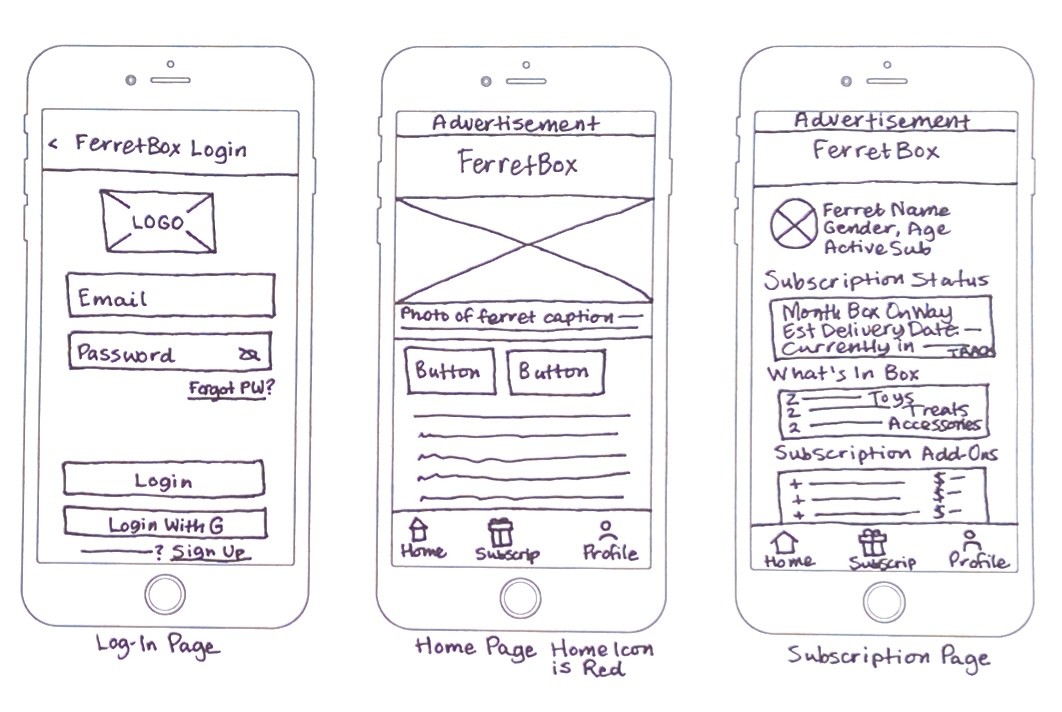
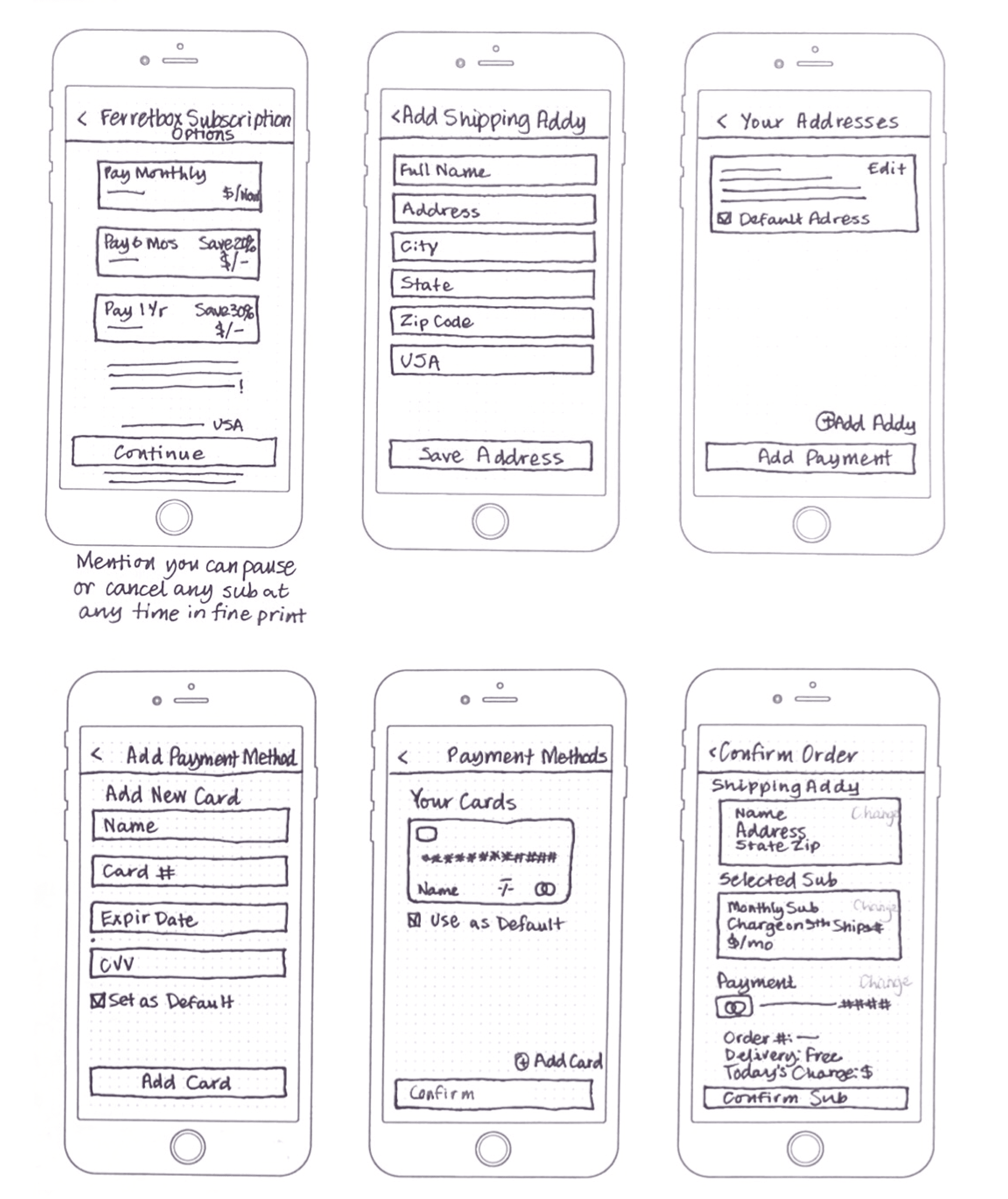
•Designed low-fidelity wireframes to map out the subscription flow and profile page before moving to high-fidelity prototypes.
•Created sketches of the anticipated screens based on user research insights.
•Looked at competitor products in the pet subscription space for design inspiration.
•Started with rough hand-drawn wireframes that were later developed in Figma.
•Learned standard wireframe iconography (e.g., an “x” through a box for an image or video placeholder).
•As a first-time wireframe creator, went through multiple iterations to ensure the wireframes were easy to understand and convert to digital formats.
Importance:
•Low-fidelity sketches provided a foundation for structuring the app and allowed for early conceptualization of key features.
•Iterating on wireframes before moving to Figma ensured the design was user-friendly and aligned with research findings.
•Reviewing competitor designs helped identify best practices and gaps in the current pet subscription market, guiding the app’s unique features.
•This step allowed for efficient development of the user interface by first refining the flow and layout through sketches.
Sketches/Low-fidelity Wireframes
Lo-Fi Wireframes Testing & Feedback
•Conducted guerrilla usability tests at a local coffee shop by asking individuals for feedback on the lo-fi wireframes.
•Quickly tested design ideas and compared different options for the subscription sign-up flow.
•Learned that users preferred clear, simple screens to make the sign-up process less intimidating and reduce friction.
•Discovered the importance of prominently advertising the ability to pause or cancel the subscription at any time without a financial penalty.
Importance:
•Quick testing enabled fast iteration, leading to a more user-friendly design.
•Feedback helped refine the sign-up process to make it simpler and less intimidating for potential users.
•Highlighting flexible subscription options (pause/cancel) increased the appeal of the service by addressing a common user concern.
Pre-High Fidelity Design Work
•Created a style guide, mood board, and logo for FerretBox to establish the desired aesthetic and branding.
•Realized these initial designs did not fully carry through as the project evolved.
•Later amended the style guide to finalize the font and visual look of the app.
•Learned the importance of editing and restraint in design, avoiding overuse of colors and font faces to improve usability.
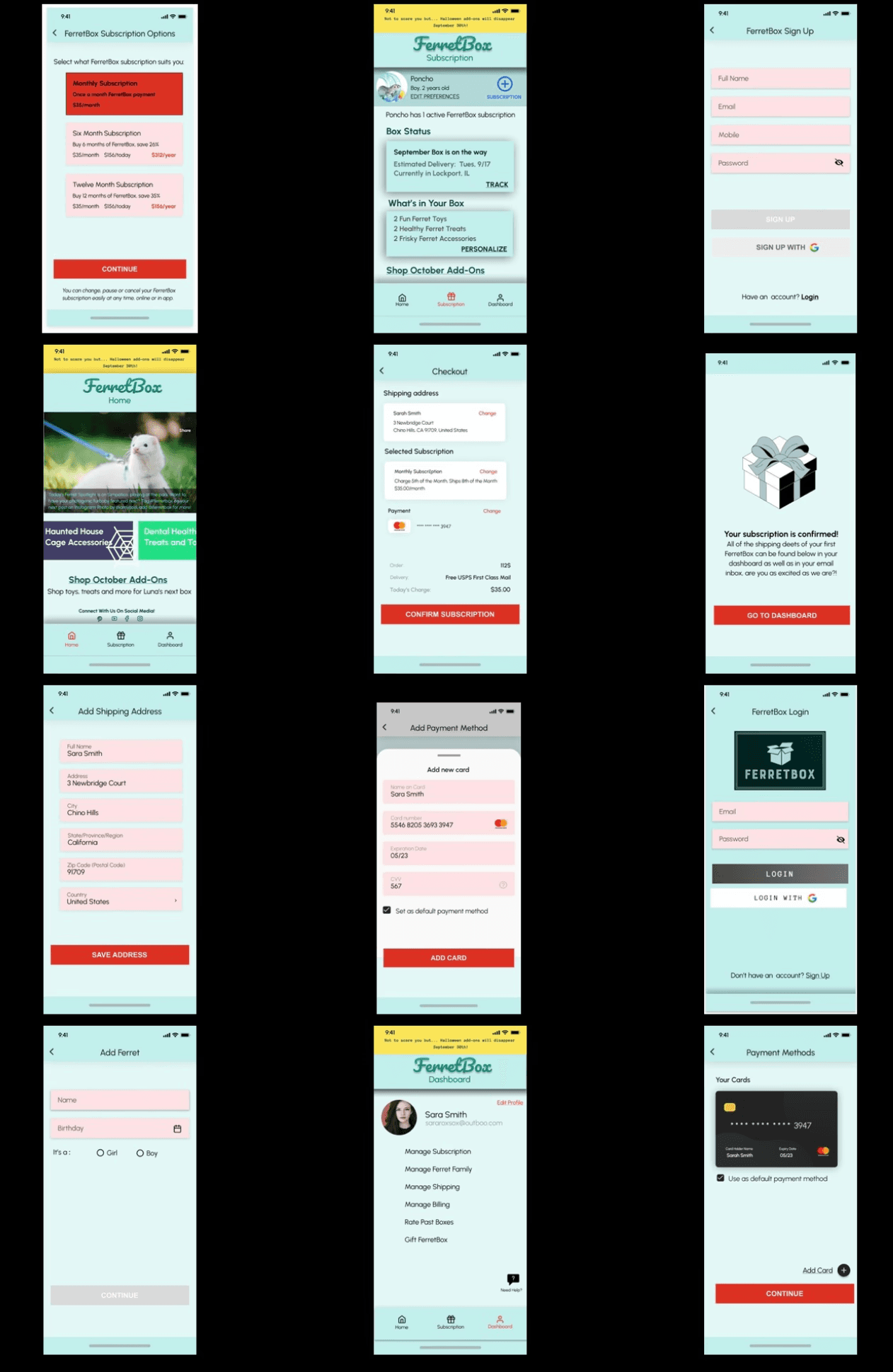
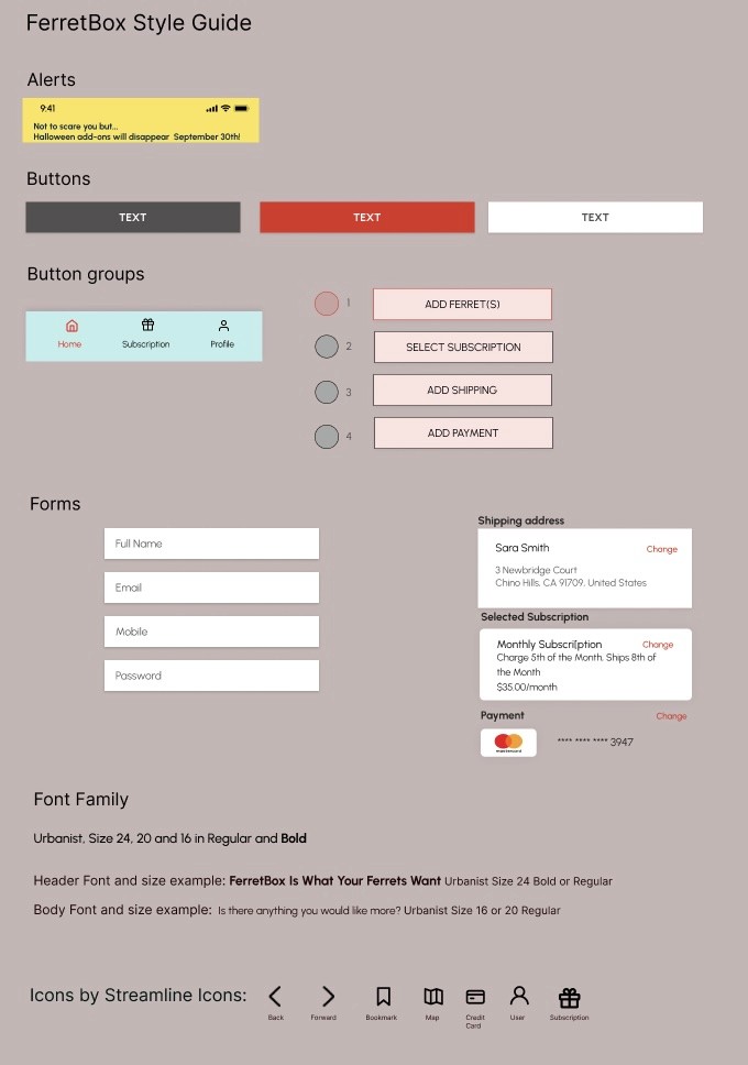
Style Guide
Here is a style guide I developed for the FerretBox app, which outlines the important elements of the FerretBox app, such as buttons, button groups, logos, forms, colors and fonts used. This helps give the app unity in future development and expansion. I worked to simplify the design and not add too much variety in color and fonts used, as that can make an app feel unorganized and busy.
Usability Testing
I spoke to five people and used a usability test script (available here) I wrote for all of the sessions. Three of the sessions were remote and conducted using Zoom and screen sharing to access the prototype and both myself and the tester could see the same part of the process.
Two of the tests were conducted in person at a local coffee shop on a quiet evening. I brought my laptop and a mouse with me so that the two in person testers could access the prototype that way. I recruited family and friends through the social network Facebook or by phone text message, asking if they had time to help test a project that is in its early stages.
I looked for people that are pet owners, preferably ferret owners. I did not know what would be problematic, but I wrote the script so that I would ask about every step in the process both aesthetically and if there was anything confusing or hard to understand about each step.
I also asked in general if the design was appealing or if there was anything they thought could be improved or anything that was missing as well as if they would use the product in the future. I began with context questions to make the users comfortable and made it clear there were no wrong answers and it would help if they thought out loud as they went along and were as honest as possible.
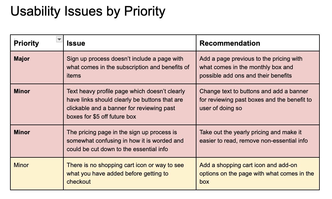
You can see the issues that I found through testing outlined below, ranging from major to minor, with recommendations for how to address the issues in the next iteration.
Before and After
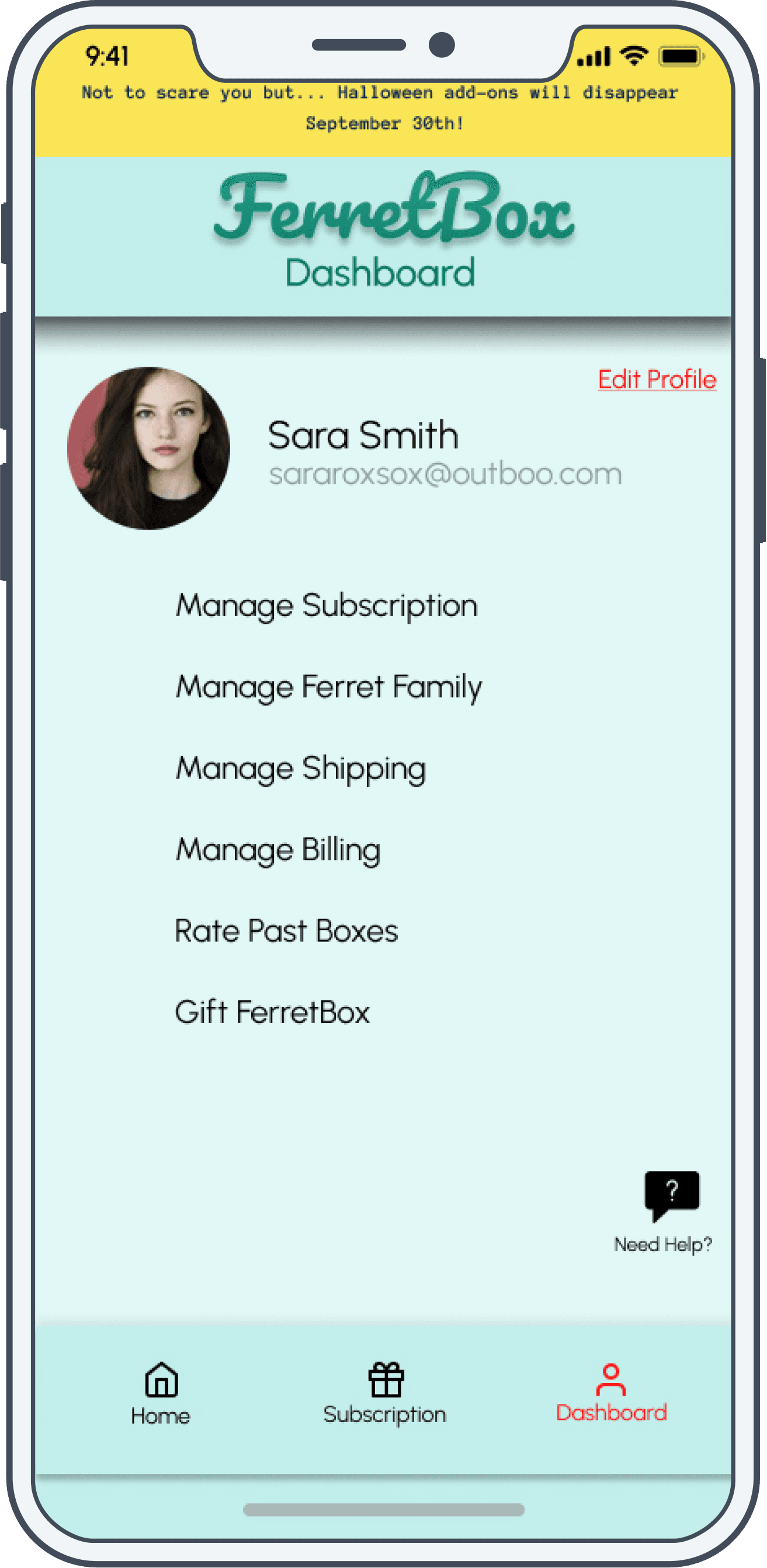
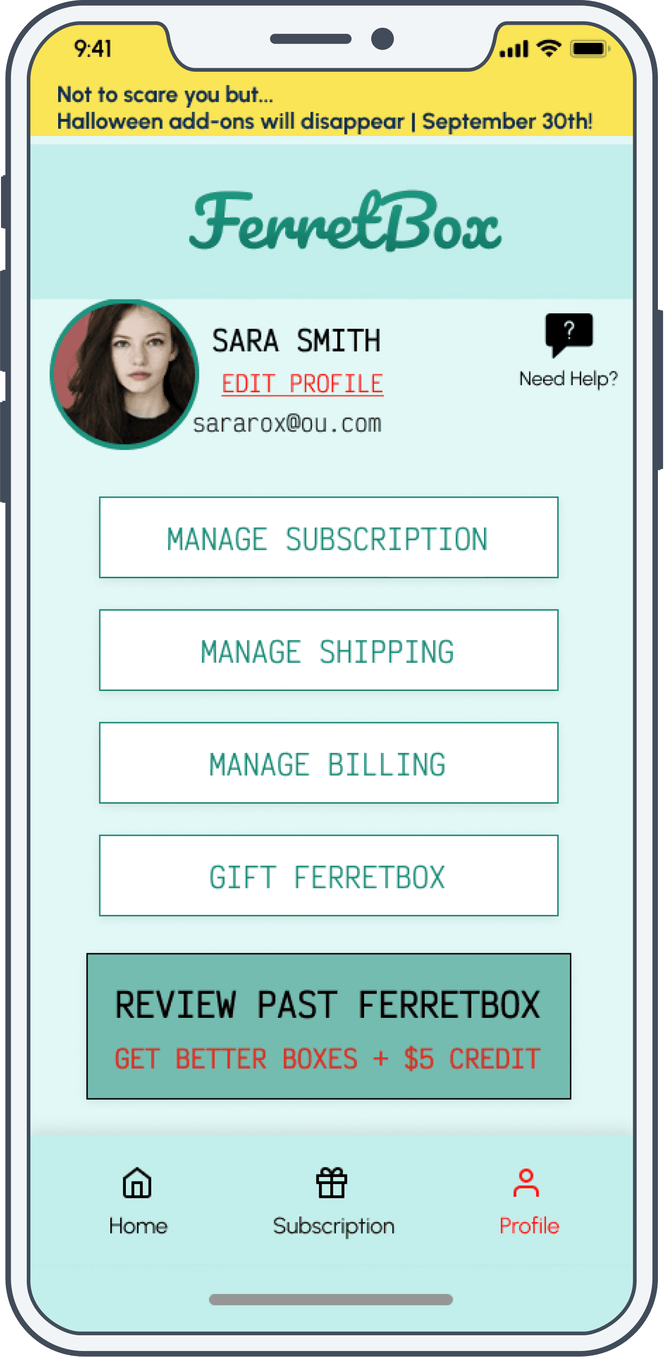
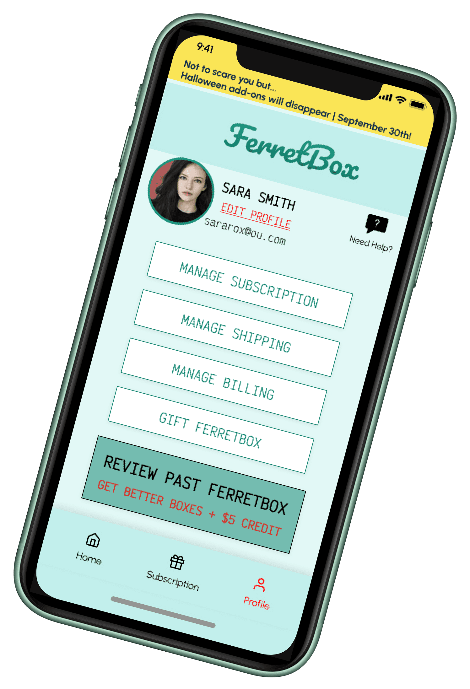
Based on feedback from the usability testing, I removed the subheading below FerretBox and renamed this page from Dashboard to Profile. I changed the text links to physical buttons for clarity and added the ability to review past boxes for a future discount and better boxes for user’s needs based on their feedback. I also moved the help button to a more prominent part of the page and moved edit profile to below the user’s name, next to their avatar. Feedback from the usability test had suggested this was more intutive.
Before and After
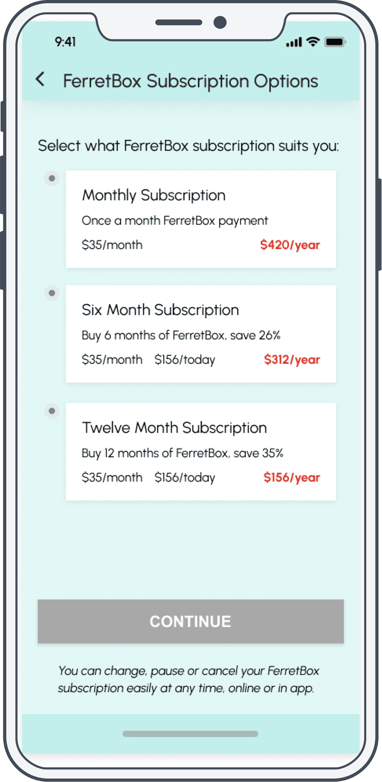
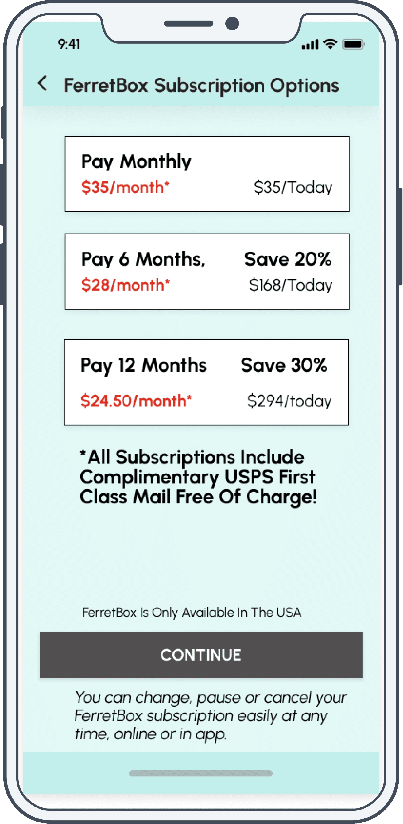
I made significant changes to the Subscription Options page that users see as part of the sign-up flow. I simplified the text-heavy options down to the most important information; the monthly cost of each option, how much the user would be paying today for each choice, and the percentage savings. I made the percentage savings prominent with each option to emphasize the savings with longer length subscriptions. I also added that all options include free shipping, and made the text stating users could pause or cancel at anu yyime larger and easier to read.
High Fidelity Screen
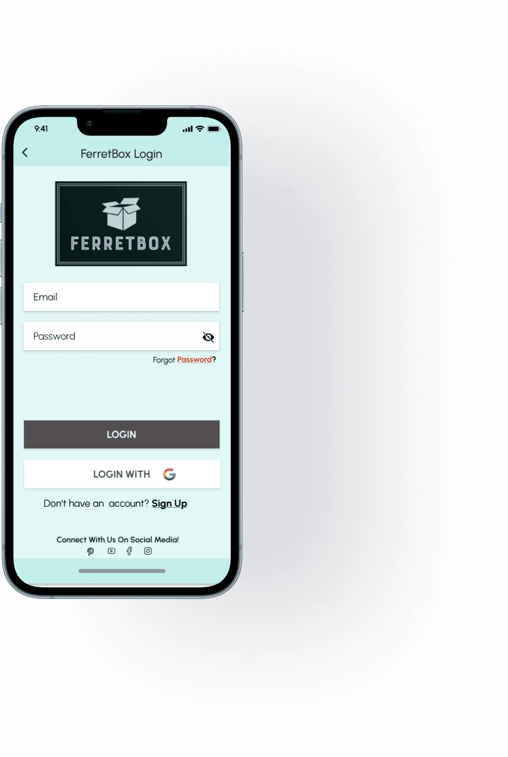
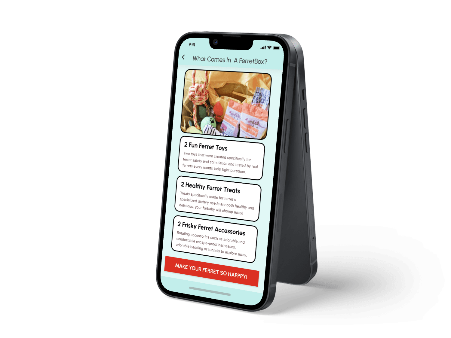
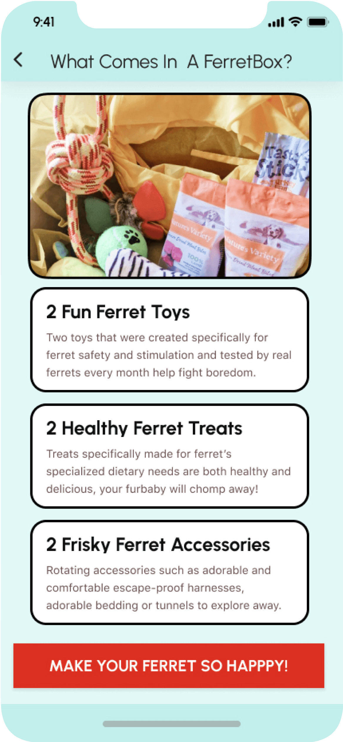
This “What Comes In A FerretBox?” page was one I had forgotten to include in the initial sign-up flow, which very importantly laid out what the user would actually be shelling their money out in order to receive monthly!
I outlined as clearly as possible the elements that would be included in each month’s FerretBox, but also worked to keep the language fun and playful, since these products were for the enjoyment and enrichment of the user’s beloved pets, and the language should reflect that joy and fun.
High Fidelity Screen
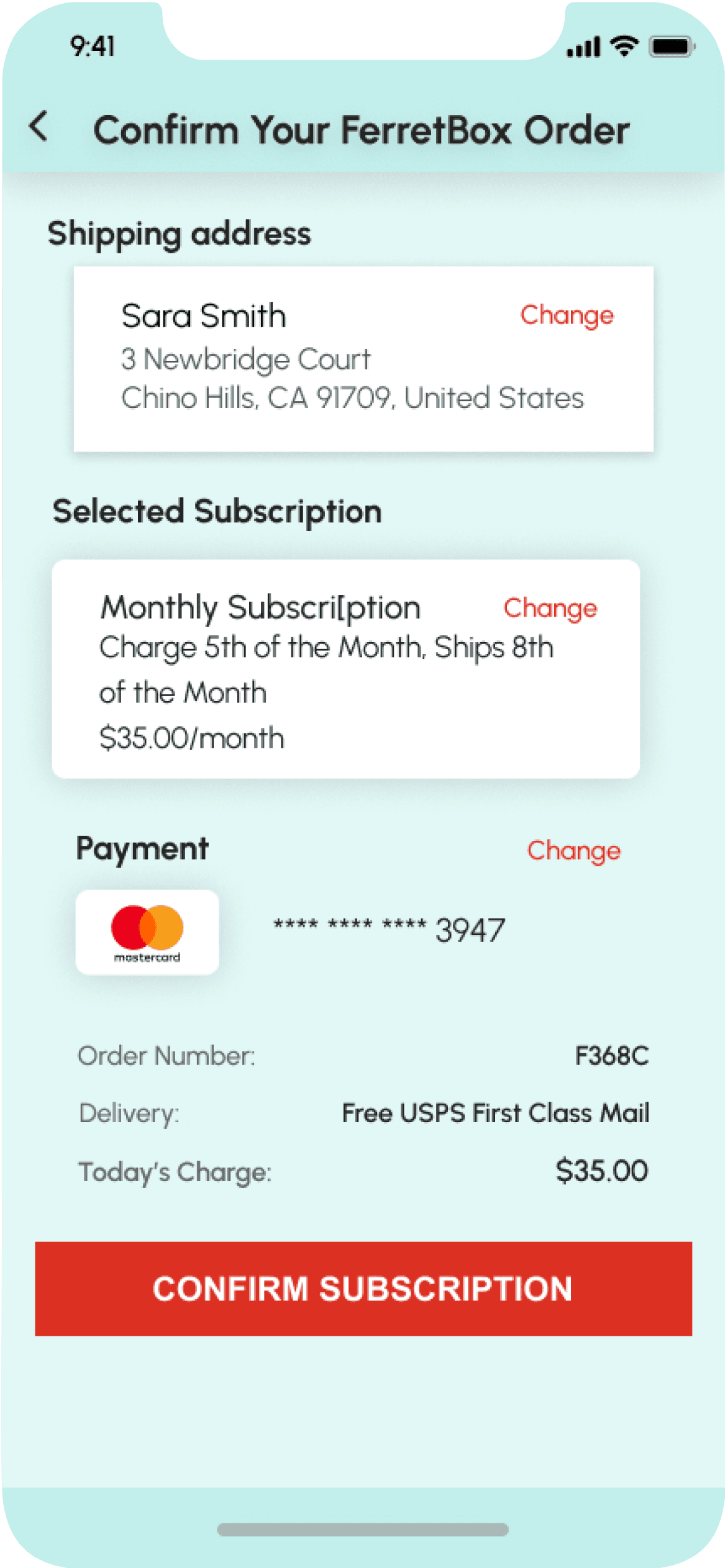
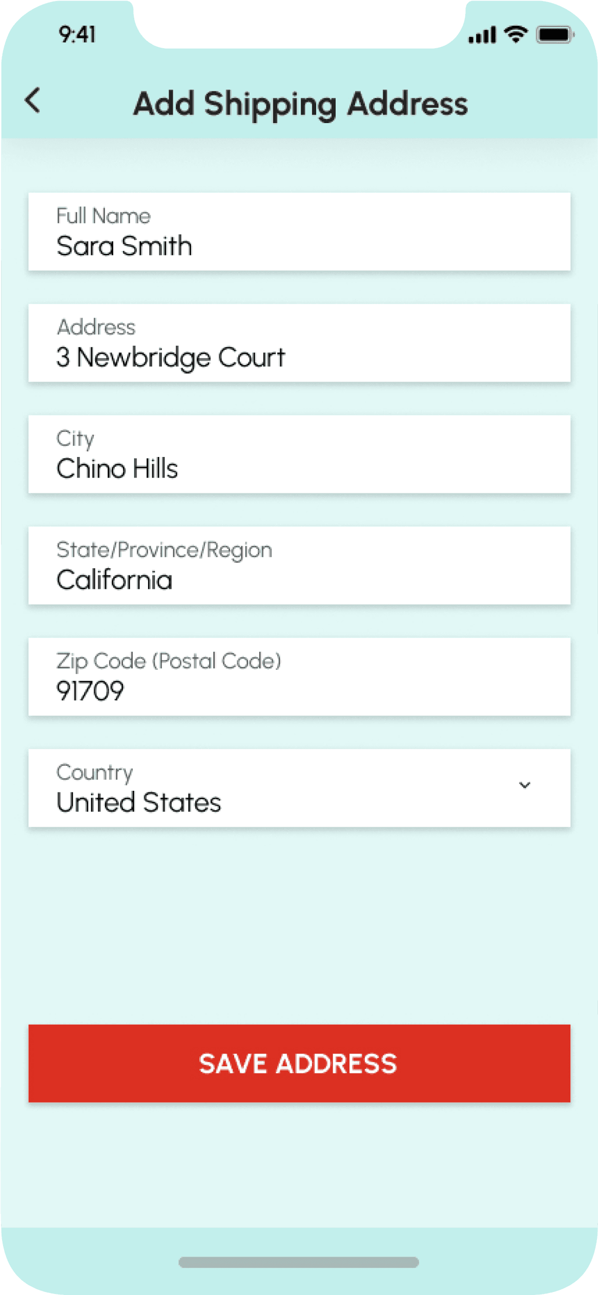
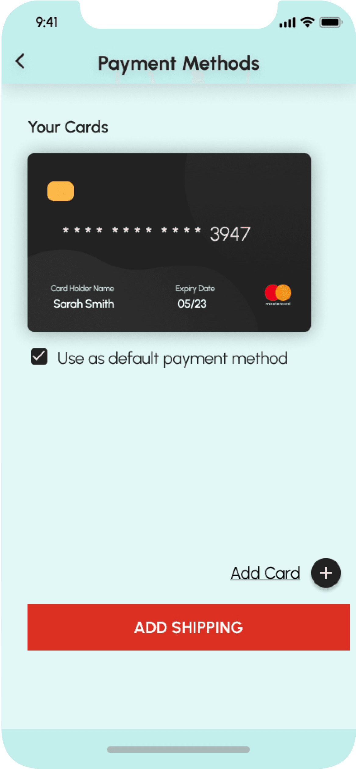
This page was not included in the previous iteration of the FerretBox sign-up flow; it gives the user a chance to look over the information they entered for the shipping address, the type of FerretBox subscription they selected and the payment method they will be using for their order prior to the order going through.
In case they had not noticed how much it would cost to sign up for a yearly membership, for instance, this page gives the user an important opportunity to look back over all their choices and information and fix anything if need be. All sections have a “change” option for easy editing.

High Fidelity Screen

Screen Name
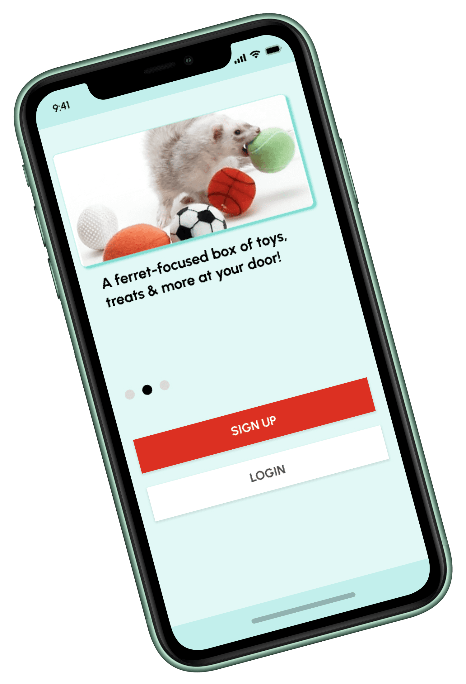
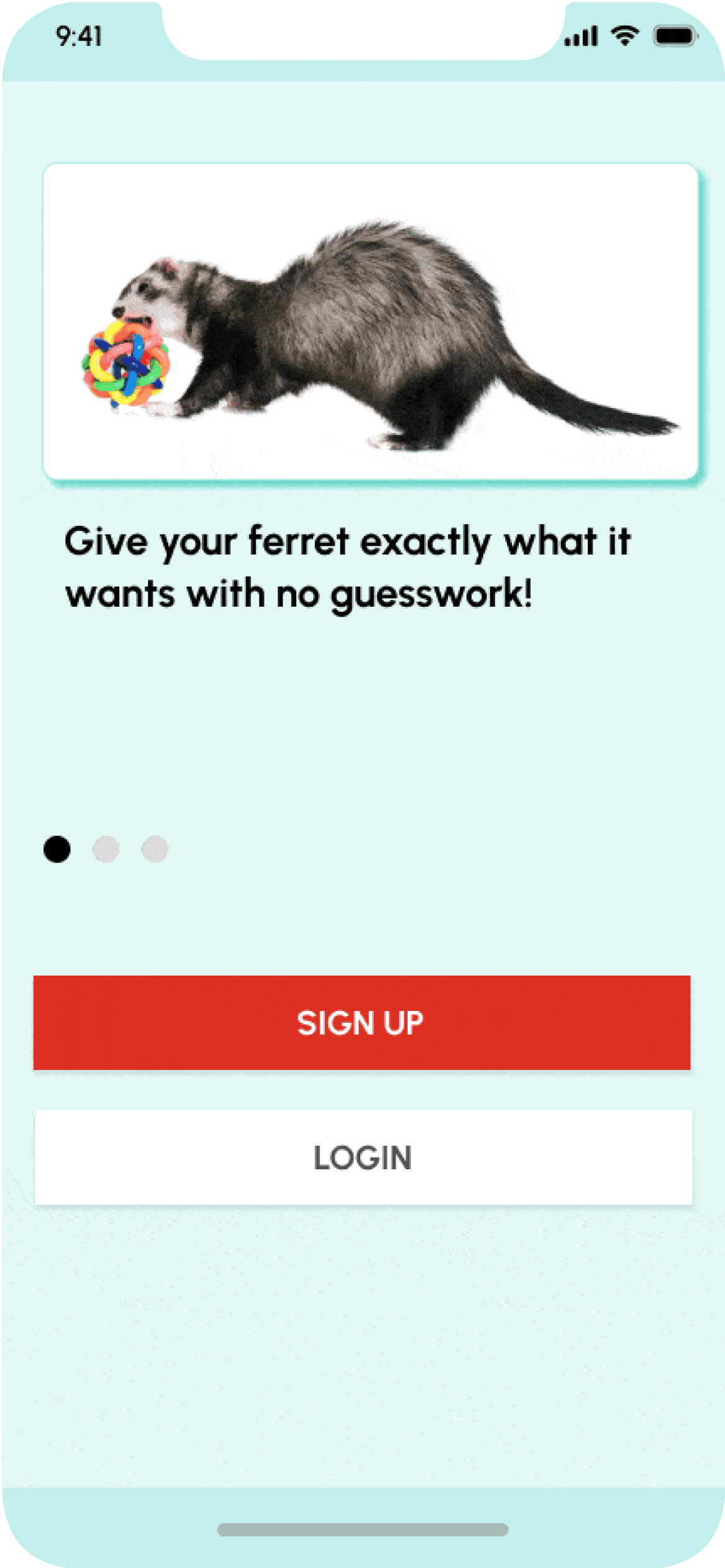
This is the first series of screens that greets any viewer of the FerretBox app. I selected three fun and playful images of ferrets having fun, playing and generally being adorable, because what ferret owner wouldn’t enjoy a reminder of the best times with their loved ones?
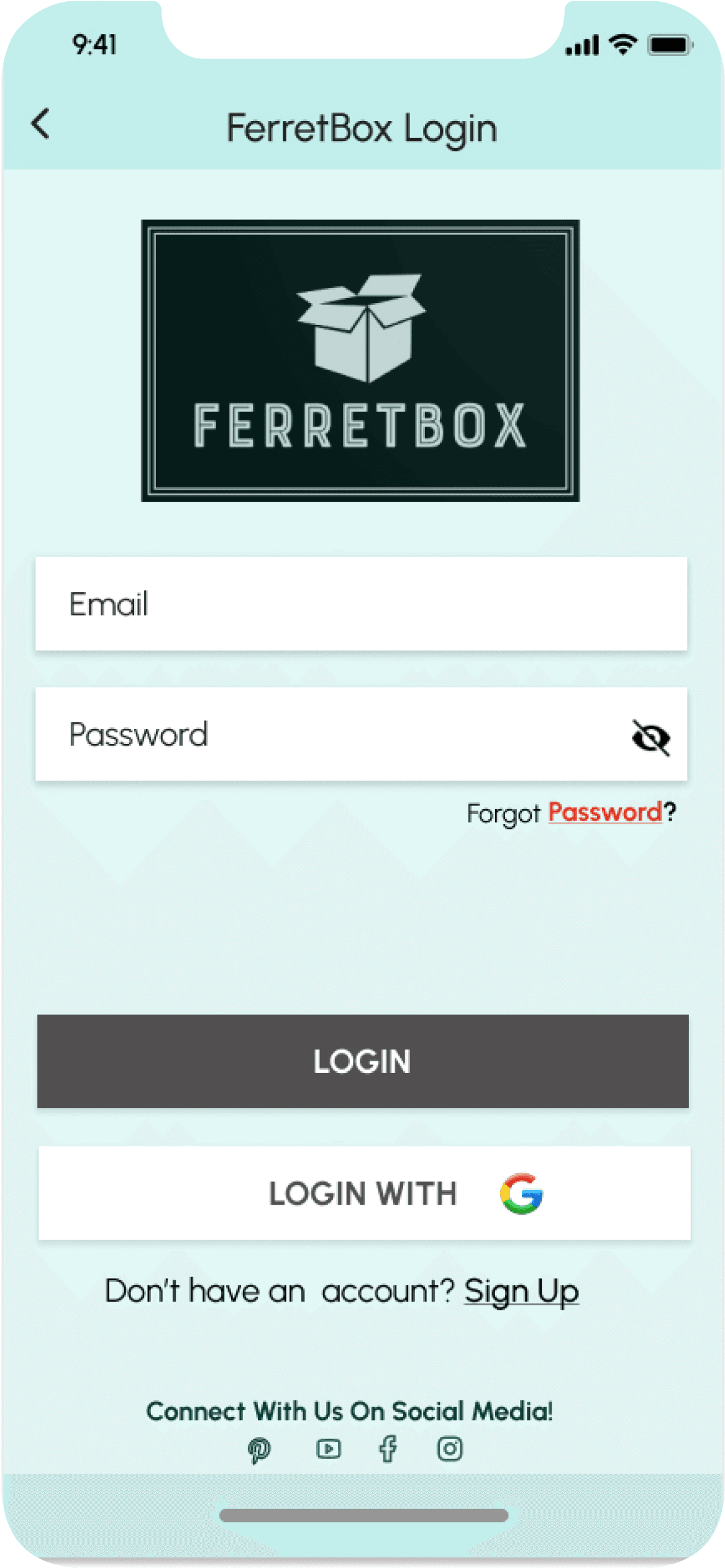
Sign Up and Login buttons are clearly labeled, so that potential FerretBox customers have no confusion where to go next and existing users as well have a clearly laid out path to login to their accounts.
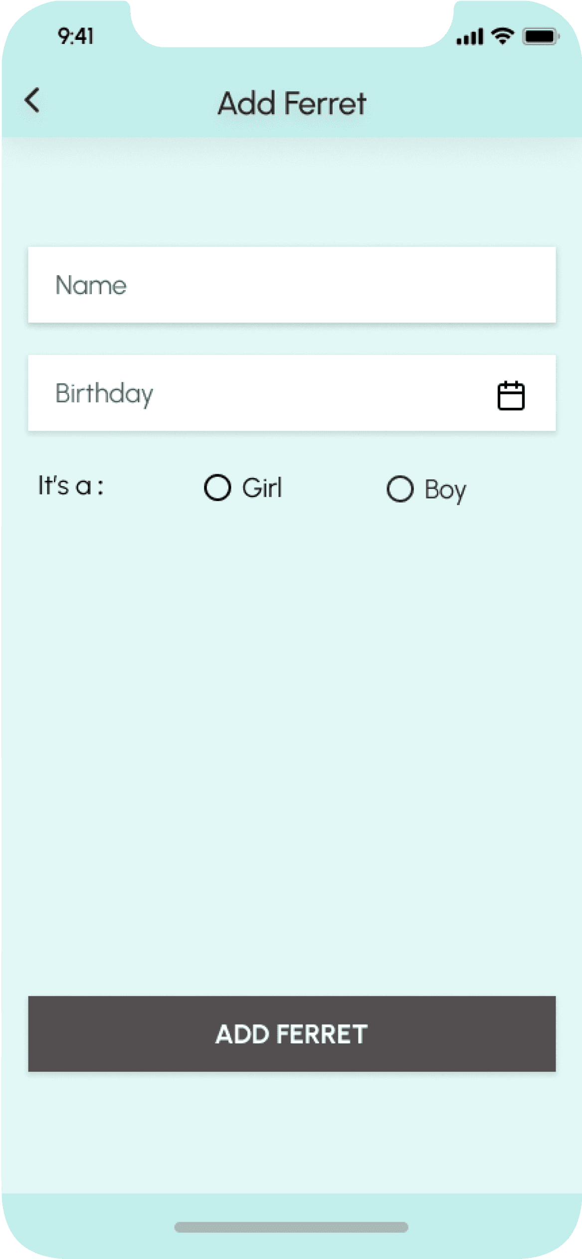
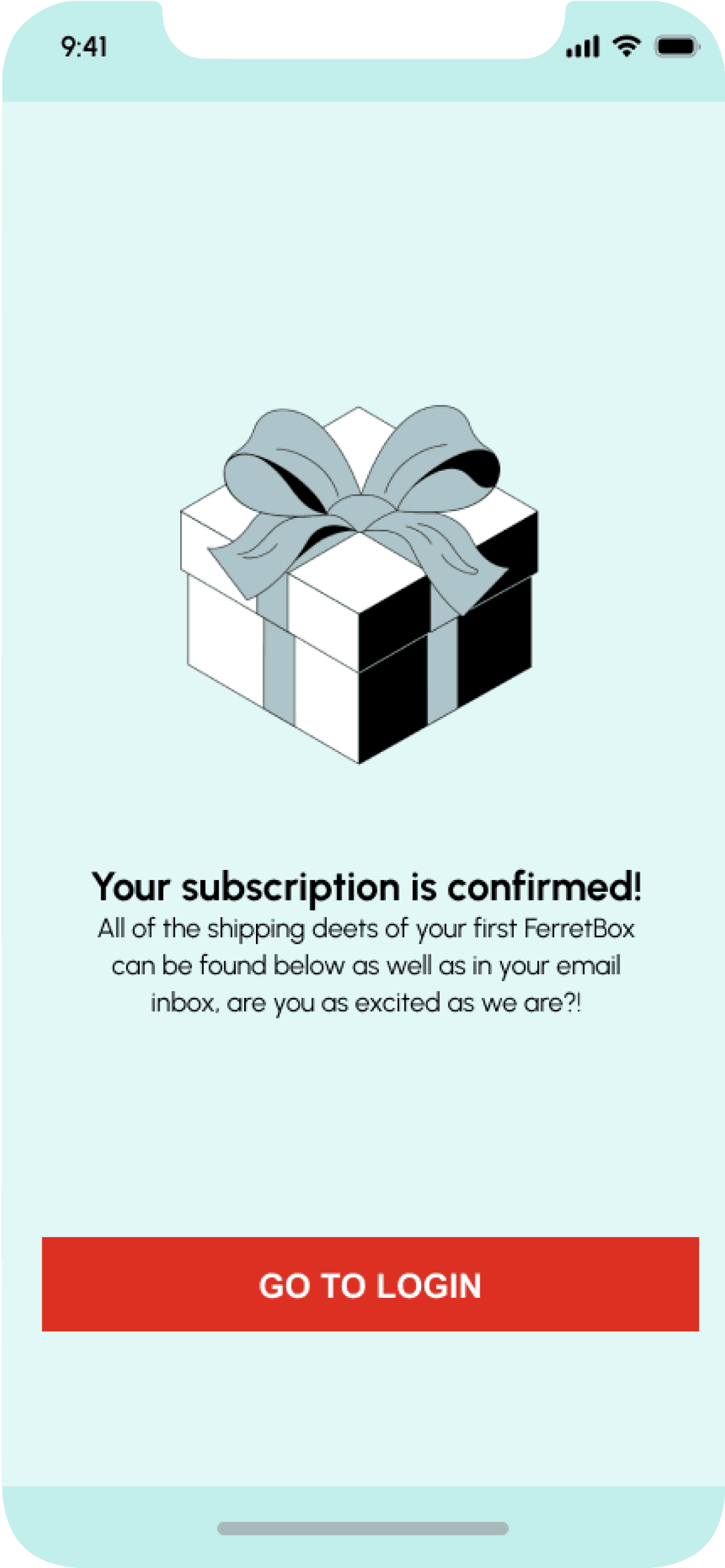
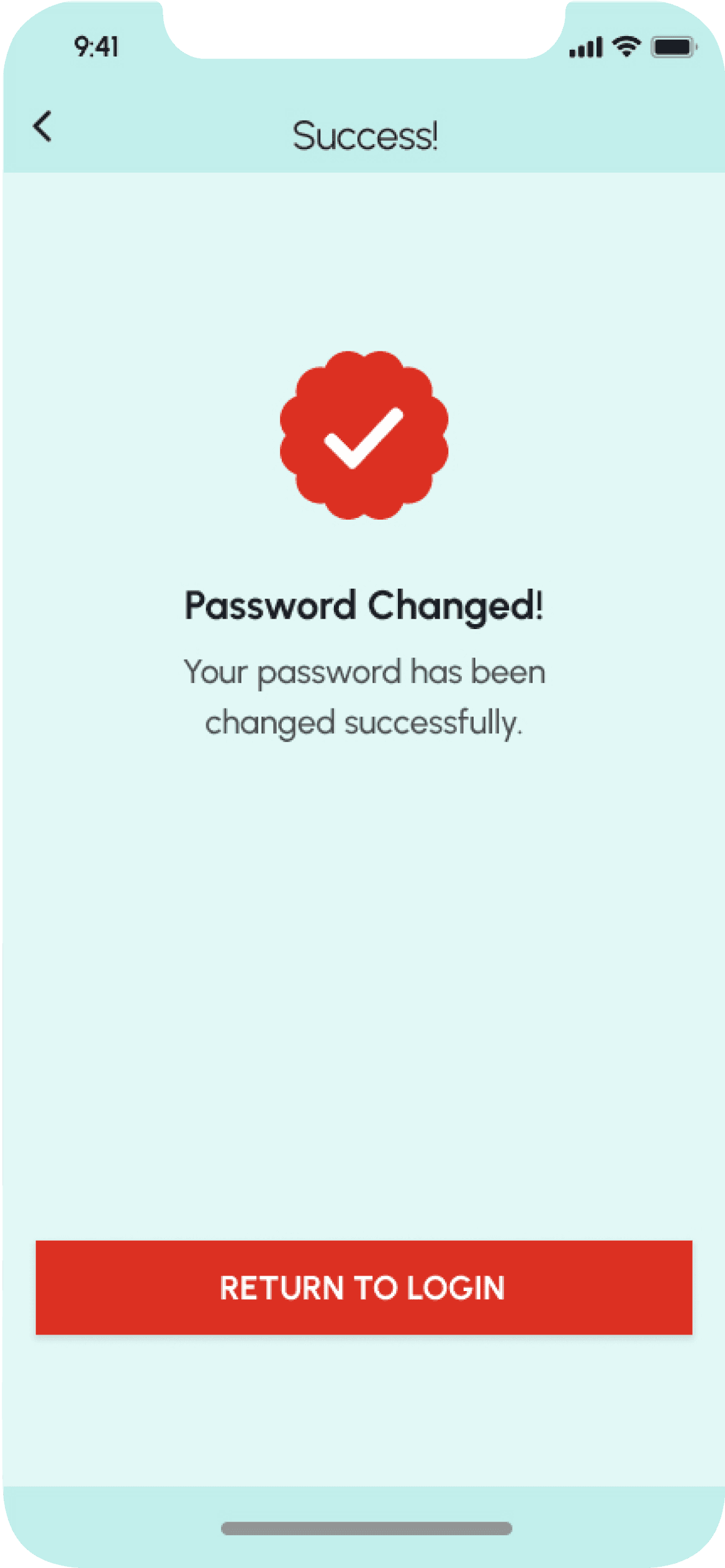
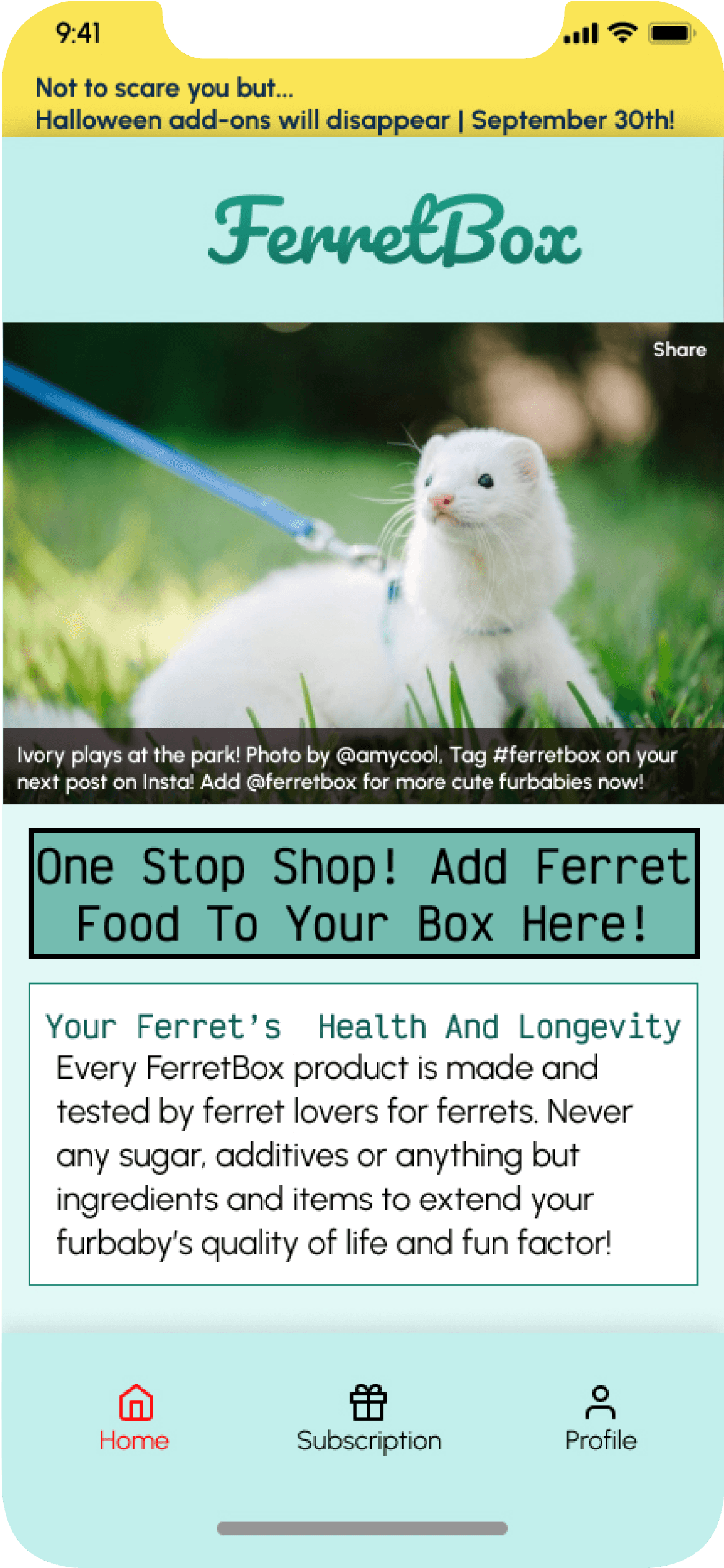
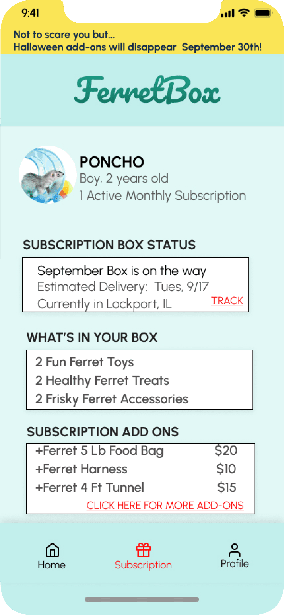
Other Screens









Outcomes & Lessons Learned
● The project successfully delivered a FerretBox prototype with an improved signup flow, a
clearer pricing structure, and personalized subscription options.
● I learned the importance of balancing user-friendly design with the specific needs of both
owners and their ferrets.
● Clarity, consistency and transparency in subscription details is crucial for user trust.
● As my first foray into UX/UI, I am happy that I delivered a FerretBox prototype with sign-up
and login flows that were easy to navigate and completed the brief.
● I successfully addressed the core challenges of busy ferret owners by creating a
subscription service that saved time and provided high-quality, engaging products, in
theoretical practice.
● Through the hallmarks of any successful UX project, I learned the basics that will
eventually become second nature to me; user research, persona development, usability
testing, wireframing and eventually the many iterations of a high fidelity prototype.
● I am proud to have created a service that solves a problem for an often overlooked
market segment and delivered a tailored solution that would improve the lives of ferrets
and their owners alike if given the opportunity.
Try out my FerretBox prototype below:
